2009-05-31

Amazing building: Atlanta Marriott Marquis hotel

Little to say, but more to see in this amazing hotel I am visiting, the Marriott in Atlanta, Georgia. The atrium, stretching from bottom level to 50 floors up, almost defies taking into a single photo, and yet it is full of architectural motives, with the curves and not-quite-repetitions of positions of concourses and bridges.

It all reminds me of a genteel version of Zion in the movie trilogy The Matrix. Even worse: aren't those closed doors and uninhabited galleries just like a prison? And another advantage of Zion over the hotel: it did not have such tacky colours in the carpets on the floors ;-)

2009-05-26

Sitting ducks and moving targets

Bumble bees may be among the slowest-flying insects, but it is not easy to catch them quite right! This weekend in the garden I tried, but the only reasonable photo is the one you see here. It takes a lot of practice, hi-speed photo bursts and still you need luck. Moreover, when concentrating on shooting the bumble bee, of course I forgot to "look around" my subject, so that now we have this distracting light-green blob of the day-lily's leaf in the background, precisely where it bothers most. And the so-called slow-moving bumble bee still was too fast a moving target for a sharp picture at 1/750th of a second. So much frustration hidden behind a photo that still is decent enough to dare and show it on the Web!

The second one, a dragonfly, is the sitting duck of this entry's title. A few minutes before, this dragonfly (or one that looked very much like it) laid eggs in the pond and I was too late to get the camera from the house. But tired of laying eggs, or just waiting for prey to fly by, it sat quietly on a reed and I could get close enough for a 'portrait'. Admittedly, I still had to crop the photo to avoid the 'Japanese flag' effect, because the tele-zoom has 1.5 meter as its minimum distance.

2009-05-21

Portrait workshop for kids was a success

Yesterday I survived a workshop for kids in a creative class--the kids (my daughter being one of them) and camera survived as well! The idea of the class teacher was to have old-fashioned portraits of just the kids' heads; they would then cut the heads out, paste them on paper made looking old with diluted black ink and then draw or cut-and-paste old-fashioned clothes and attributes, all in black, greys and white. I gave a short introduction about differences between photography 'then' and 'now', and a little about ligth and shadow in portraits. Then the teacher handed round some copies from real old portraits (found on Flickr).

It was quite nice to do, but the real fun started when I was busy quickly converting the photographed portraits to black-and-white and printing them (I love working with Lightroom!). For then my daughter got hold of my camera and started making modern portraits of her friends! They had gotten the message about differences between then and now, and they had fun taking pictures and modelling. Perhaps that fun with photos shoots was an even more important result than my portraits rolling out of the printer.

This time's picture is a slide from the presentation I made. You won't get to see portraits of children whose parents did not get a chance to agree to their pictures being published.

2009-05-16

Just some architecture

Only nature, in the last weeks. High time for my other love: architecture. Clear lines, clear light--good old modernism in an airport building. The balance of verticals and horizontals is stressed by the square format of the photo--admittedly, to the left it got boring, so I cropped the picture. A person in the picture (an intrusion of nature?) adds a little movement and interest to the straight lines in almost monotonous grey, but remains a semi-silhouette. The man's lorry(?) has a few dashes of red, drawing attention to the man, but more than that also making a "warm" statement near the person, counterbalancing the few cold, blue accents in the architecture.

2009-05-10

Yvonne van der Mey wins with photo "against the rules"

Yvonne van der Mey, who directed the workshops on nature photography that I followed the last two weekends, won a prize! The prize photo, entitled "Leopard male in the early morning, desperately looking for a female" she had shown to us during the workshop as one with which she was quite satisfied, although it went against a primary rule of composition, namely that you ought to see the subject's eyes in a portrait-like picture. But here, clearly, that rule does not really apply: we as viewers are following the leopard's gaze into the depth of the unknown, almost feeling his anxiousness.

That's a point about so-called rules of composition: you have to adhere to most of them to avoid mistakes in your photo, but you must know when to break one of them to make a truly good shot.

By the way, I wonder if the title of the photo was really true: maybe the leopard was just looking for food, or was frightened through hearing a pride of lions roaring, rather than being on the lookout for a mate, but it is a nice title that adds to the picture's meaning--it makes the animal more symphatetic to human viewers, and if that's what gives you a prize, why not?

2009-05-04

Black-and-white in colour, or a dandelion and levels of meaning

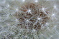
Conventional wisdom has it that photos of patterns and structures are prime targets for black-and-white. The dandelion of this week's blog was precisely such an object, I thought when taking the picture, but when I saw it on the computer screen, I did not change it from its original colours. The brownish, unfocused background adds something to it. Without this collective of seed ends in their original colour, I found the photo too abstract, too much shouting out that it wanted to be an artistic photo rather than a real picture of a flower. Now, with colours, I think its artistic value is more subdued--and heightened by that very fact. It now is a photo with two layers of meaning (at least): the seedhead itself and the pattern of star-form lines.

At a third level of meaning--if you want to go that far--the colour photo is a symbol of the transience of life, precisely because it refers more clearly than the black-and-white version to the seedhead itself. For the seedhead is destined to let go of the seeds at the first wisp of wind, of course.

The second photo here was not quite as good as the first one (in my eyes) for technical reasons: it lacks depth-of-field in the centre. But it help illustrate the point: this one, although also a close-up and also playing with the star-form patterns, is obviously a dandelion even in black-and-white and does not lose its layers of meaning by the reduction of colour to black-and-white.

By the way, you can see I am influenced by having begun to read a book I just bought: Jeffrey, Ian. 2008. How to Read a Photograph: Understanding, Interpreting and Enjoying the Great Photographers. London: Thames & Hudson. He finds so much more meaning in "simple" pictures, that you almost start to think your own photos have meaning(s), too ;-)