Jeffrey Friedl's most recent post was about a French photographer and author, Stéphane Barbery, who borrowed Jeffrey's camera for a while because he wanted to enjoy 'a thin depth of field with my Nikkor 85mm f/1.4 that his current camera can't match.' That's even less of depth-of-field, or more selective sharpness, than f/2.8, especially with Jeffrey's full-frame camera! By halving the aperture number, the selectivity of sharpness is doubled--as a figure of speech.
Are those lenses more affordable in Japan, where he lives, or is he just fanatic about maximum light and miminum depth-of-field? Anyway, it makes me jealous--not because of the price or the weight (both must be tremendous), but because of the photographic possibilities it gives.
What also makes me jealous is how this Stéphane Barbery has a very different sense of photographic beauty. Friedl discusses a 'throw-away test shot' that Barbery made and that he finds beautiful. So did I. Have a look here; it also gives links to Barbery's web site--worht a look too!
2009-09-19
Other autumn pictures
 My autumn depression is not as bad as yesterday's entry suggested: I may not have autumn colour photos, but the other typical autumn subject in nature is present in my photo collection: mushrooms and toadstools. Though I don't know the difference between the two. My dictionary says mushrooms are the edible kinds, toadstool the poisonous ones--never mind, I'm not going to collect any; two-thirds of the species in the Netherlands are on the Red List of endangered species. You can enjoy their beauty by watching--and photographing of course!
The photo, made in Holland a few autumns ago, may be of a mushroom called Oudemansiella mucida (synonym: Collybia mucida, teaches the Dutch part of the Wikipedia). I made a close-up with selective sharpness (f/4.0) to emphasise the fragility and the subtle colour; not for nothing the Dutch name would translate as 'china/porcelain mushroom'.
One thing had to be retouched, I admit: there was a bit of cobweb hanging from the hood which I clone-stamped away in Lightroom (who needs Photoshop?). Forgotten to 'look around' my subject when I took the picture! But if I hadn't told you, you would not have known, would you? If you find the spot where this photo was retouched, you earn a bottle of wine. Come and get it! ;-)
2009-09-18
Ready for those autumn colours
Good tips to make photos of autumn colours just that little bit more intense and interesting, I found in the Digital Photography School.
Flipping through my photos for a fitting illustration of this link, I discovered that I have no nature pictures expressing autumn. Do I suffer from unconscious pictorial autumn depressions? (Wonder what my physician would say about that description of symptoms.) Well, no more now: I must make that ultimate autumn colour picture this year!
Flipping through my photos for a fitting illustration of this link, I discovered that I have no nature pictures expressing autumn. Do I suffer from unconscious pictorial autumn depressions? (Wonder what my physician would say about that description of symptoms.) Well, no more now: I must make that ultimate autumn colour picture this year!
2009-09-17
One in a million
 There are about 1 million active weblogs around on this planet. Or a bit more: 1.5 million, in fact. That's a guess (as Katie Melua sang about the size of the universe), calculated from Technorati's claim that from 133 million blogs (end of 2008) 1.1% had been updated in the week before their survey. So there is way less than one in a million chance of your finding this blog of mine--taking things purely statistically.
 (Statistics from NRC Handelsblad of 2009-09-16.)
I'll keep going though, hoping that you'll find this place for non-random reasons!
So just for your pleasure, a random photo on my blog's theme. Here are two Greek beauties from the national history museum in Athens--showing that beauty is timeless, even though different across time ;-)
2009-09-13
Sunflower patterns
 Harvest of the sunflowers. Most are to be kept for the birds, coming winter (if we are advised to feed them again; at the moment, because of a contagious bird disease, we'd better not stimulate their getting together). But birds don't wait: some of the flowerheads were already mostly eaten (first picture).
For photographers (and mathematicians!), sunflowers are irresistible because of the patterns that the seeds make in the flowerhead. And as usual: patterns come out better if your eyes are not distracted by colours, so the second picture comes in black-and-white.

2009-09-12
Dundalk, earlier this year
When selecting photos for the camera club's next meeting, I stumbled upon this one. I had forgotten about it, and won't show it there, but still I think that the play of hard but curved lines is kind of neat, especially in black-and-white and, even more especially, because the curves and diagonals of the empty street are contrasted--maybe you should even say they are 'broken' by a few verticals coming from the bottom of the picture. First there is the lantern, which still belongs in the man-made hard landscaping. But then there are the three young trees. Still leafless (it was early spring), and vulnerably small. The black-and-white makes the picture a bit ominous, to my mind: will these little trees survive? Yet the natural forms against the hard lines seem to say that nature will not be subdued! And if you then look closely, there is more of nature in the picture: more planting at the bottom, and some wild grass (you cannot call it a lawn) in the top-right corner. There is hope.

2009-09-09
Close to f/2.8
The closest my standard lens comes to selective sharpness is f/4.5, so that's what I used here.
The "composition" of the still life is just as they happened to be lying on the table. It is almost a matter of principle to me that I take reality as given and do not interfere to make compositions "better" than what fate gives me. Exception: blades of grass or dead leaves and similar small things that I can easily take away.
Looking at the photo, I don't like the horizontals of the courgettes in the middle: they break the dominant verticals in the composition, and therefore take attention away from the area of sharpness, more in the foreground. Though that is a little better in the original large-size photo: there you see that the courgettes are really out of focus and the sunflowers stand out very clearly (or rather: sharply) from the dark-green background. (That effect is one of the reasons why you should never judge photos in the small screen on the back of your camera: sharpness and bokeh are very different in the original size.)
2009-09-05
Between f/2.8 and f/64 (2): Mr. 2.8
You can overdo with selective sharpness at f/2.8. Another of my favourite bloggers, Jeffrey Friedl, always uses f/2.8, it seems.
Did I mention Jeffrey Friedl before? No, I did not, I believe. He is an American who lives in Japan, and who is an avid amateur photographer--if he is an amateur, that is. For like a professional he seems to be taking photos full-time, and of everything, though he is especially good at landscapes—Japanese landscapes are good anyway and he makes them even better! He uses f/2.8 to make a subject stand out clearly from the background, and his professional lenses help to make the bokeh especially good: the number of blades in the diaphragm and their curvature seem to play a role in making the gradient from sharp to un-sharp as well as the rendering of un-sharp objects without irritating double contour lines and the like.
I came across Mr. Friedl when I looked for a smart way to upload photos to Flickr from Lightroom, and the official Adobe Lightroom website linked to his plug-in. Jeffrey Friedl proved to be a real Lightroom buff, who published all kinds of upload plug-ins, for all (well, almost all) kinds of photo sites. Once you know the trick, it's probably not so difficult anymore. Besides, his real profession is in programming. The Flickr upload plug-in was worth all its money (which was not much)--and more! It works really handy, once you have followed the (very clear) download and installation instructions from Mr. Friedl’s site.
As I said, he uses f/2.8 all of the time: check his blog full of photos, under each of which he neatly gives the essential statistics of time, aperture and if you drill down a bit also location(!). If nothing else, you can find a few nice wallpapers among his collection (watch out, that page takes some time to download!). But I wanted to make a little bit of fun of this Mr. 2.8. Once he wanted to take a group picture of a bunch of children and he was frustrated at not getting them all in focus at the same time. The examples he showed a few days before, again gave the statistics: f/2.8 most of the time. In the final one he used f/5. If he had simply gone down a few stops to, say, f/8 (the aperture at which many lenses have their optimum resolution and sharpness), the whole group would have been in focus from the beginning even though kids tend to move a lot more than landscapes—no problem at all! Even good photographers may forget their basics for a moment, sometimes… As long as you remember in the end!
Between f/2.8 and f/64 (1)
At Earthboundlight a blog entry appeared this week to answer a reader’s question: ‘Why would you want to have an f/2.8 lens?’ Bob Johnson, the author of Earthboundlight, looked at this question from the landscape photographer’s point of view. In Ansel Adams’s days, with the big plate cameras, you needed f/64 to get the ‘grand vistas’ sharp from front to end—that’s why Ansel Adams was member of the Group f/64. Current lenses ‘only’ go to f/22 (sometimes f/32), so landscape photographers tend to use those small apertures—and a tripod, because you get long exposure time at small lens openings. Luckily landscapes tend to stay in place long enough ;-)
 What Johnson did not say was that at smaller formats, you get the same depth-of-field at lower aperture numbers. That is why it is so easy (relatively!) to make macro photos with compact cameras: with their tiny sensors, they get that flower detail all sharp at full opening, where a DSLR (especially a full-frame one) must stop down to f/22 to get the same. So for a landscape to be sharp from foreground to horizon, you can make do with f/22 rather than f/64 on a DSLR—if you want it all sharp.
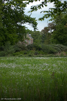
It gives a classical look to—especially—landscape photos to have them sharp all over. Give it a sepia toning and you’d almost believe it was a 19th century picture! But most of the time, you don’t need sharpness all over to get the effect you want: selective sharpness is much more creative. You don’t need that grass and branch in the foreground to be sharp for them to have the effect of suggesting more depth to the photo with the manor house in the background.
Selective sharpness also works in close-up photos: this minuscule blueberry flower was all you need to see sharply—it conveys the spring feeling much better with the strong bokeh (‘unsharpness’) than a picture bewilderingly full of sharp details would have done.
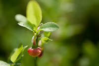 Both these photos were taken at f/2.8—I only have one lens that opens so widely. The wide aperture has the advantage that you get more light into the viewfinder, so you see more clearly and you (or the camera) can focus more precisely. Moreover, f/2.8 often signals professional lenses, which also have other advantages, like minimum distortion of straight lines, minimum flare, minimum chromatic aberration and other flaws. Their only disadvantages are weight (that kept me from choosing one as my standard lens)—and price…
 What Johnson did not say was that at smaller formats, you get the same depth-of-field at lower aperture numbers. That is why it is so easy (relatively!) to make macro photos with compact cameras: with their tiny sensors, they get that flower detail all sharp at full opening, where a DSLR (especially a full-frame one) must stop down to f/22 to get the same. So for a landscape to be sharp from foreground to horizon, you can make do with f/22 rather than f/64 on a DSLR—if you want it all sharp.
It gives a classical look to—especially—landscape photos to have them sharp all over. Give it a sepia toning and you’d almost believe it was a 19th century picture! But most of the time, you don’t need sharpness all over to get the effect you want: selective sharpness is much more creative. You don’t need that grass and branch in the foreground to be sharp for them to have the effect of suggesting more depth to the photo with the manor house in the background.
Selective sharpness also works in close-up photos: this minuscule blueberry flower was all you need to see sharply—it conveys the spring feeling much better with the strong bokeh (‘unsharpness’) than a picture bewilderingly full of sharp details would have done.
 Both these photos were taken at f/2.8—I only have one lens that opens so widely. The wide aperture has the advantage that you get more light into the viewfinder, so you see more clearly and you (or the camera) can focus more precisely. Moreover, f/2.8 often signals professional lenses, which also have other advantages, like minimum distortion of straight lines, minimum flare, minimum chromatic aberration and other flaws. Their only disadvantages are weight (that kept me from choosing one as my standard lens)—and price…
2009-09-02
Beauty in 36 Months
If, like me, you are interested in what makes beauty in a photo, you're obliged to buy Dutch photography magazine Focus for the next 36 months. For they started a new series of one-page columns called 'beauty for the advanced'. Hopefully a bit tongue-in-cheek the introduction states: 'The experience of beauty in photos is complex. After much research it appears that 36 elements are important for it. Usually in combination.'
 Element number one is: focus, or rather out-of-focus. Out-of-focus photos suggest things, stimulate the viewer's phantasy. And they say a couple of other things about unsharp pictures, all true and interesting. But then the paragraph ends on: 'This is perceived as artistic.' Is this serious? Is it Flemish-Dutch (the columnist might be Flemish--I don't know)? Or is it ironic: who would want to be accused of being perceived as artistic? I don't know what to make of this column, but I will follow it for the next 36 issues--I subscribe to the magazine anyway.
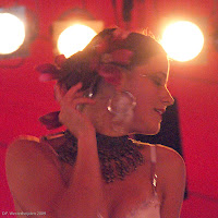
And it inspired me to show you this photo: taking the idea of 'unsharp' in a slightly different manner, this portrait of a belly dancer at the Sonsbeek Theater Avenue, last month, is no out of focus, but as it was made without using a flash, there is some unsharpness due to the dancer's movement. Besides, there is unsharpness because I used a high ISO setting (6400, to be precise) which gives visible specles. Does this make her more 'symbolic', 'not THAT woman but THE woman'? Beauty?
 Element number one is: focus, or rather out-of-focus. Out-of-focus photos suggest things, stimulate the viewer's phantasy. And they say a couple of other things about unsharp pictures, all true and interesting. But then the paragraph ends on: 'This is perceived as artistic.' Is this serious? Is it Flemish-Dutch (the columnist might be Flemish--I don't know)? Or is it ironic: who would want to be accused of being perceived as artistic? I don't know what to make of this column, but I will follow it for the next 36 issues--I subscribe to the magazine anyway.
 And it inspired me to show you this photo: taking the idea of 'unsharp' in a slightly different manner, this portrait of a belly dancer at the Sonsbeek Theater Avenue, last month, is no out of focus, but as it was made without using a flash, there is some unsharpness due to the dancer's movement. Besides, there is unsharpness because I used a high ISO setting (6400, to be precise) which gives visible specles. Does this make her more 'symbolic', 'not THAT woman but THE woman'? Beauty?
2009-09-01

Subscribe to:
Posts (Atom)