2008-04-30

What are you looking at?

Let's get back to basics, before we wander further off into the realm of estethics: photos are meant to communicate. I want to show you something, but as communication theory discovered, and as postmodernists made popular, the three elements sender - message - receiver are different. What are my intentions? What is embodied in the message? What do you see?

Most of us think of words or text, when we think about communication. Like this text. That is a difficult enough medium to pass a message from me to you. Quoting Karel van het Reve again: 'it's impossible to write so clearly that you are not misunderstood.' In my work, which involves writing a lot of texts, I am acutely aware of that and I try to write clearly, I repeat my message in different words, I use 'metatext' to tell readers what I intend to do, what I am going to do, and I summarise to tell them what they should have remembered from the previous section. For the attentive reader there is redundancy in the text, and 'tedium' (as my former colleague Guy Neave once called all the reasonings and references that make up so much of social science writing). And still people quote me wrongly! Or students don't understand and they fail for their exam. Sad, isn't it?
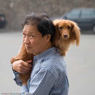


One of our famous sayings is that a picture says more than a thousand words. That would mean that an average scientific journal article of about 6,000 words could be replaced by 5 or 6 pictures. My problem is that with a picture, I don't know which 1,000 words I've captured! I know, of course, that something in a situation caught my attention, fired a signal in my brain that 'this is a nice picture!', and triggered my finger to push the button. What caught my attention, why was this man with dog a nice picture? I think, looking at it a few weeks after taking the photo in Taiwan, that it was the contrast of the large man's head and the little dog, the fact that the dog was being carried instead of running on all fours along the pavement, and finally the curious yet friendly way both man and dog looked up to me as I held the camera aiming at something behind them (a garden, now no longer in the picture). Those are three potential messages in 55 words (way less than 1,000). Is it one of the three, or the combination of all three those messages, that makes this into a good photo to you? Or do you read something else in it that I did not intentionally put into it?
Reactions are invited!

2008-04-29

Sin and Sims

Really, it was an accidental mistake! In my previous one I wrote 'sinplicity' instead of 'simplicity'. No need to call Dr. Freud to help; it really was just a matter of hitting the next key on the keyboard. But the error may come in handy: simplicity without sin is not beautiful. Sinplicity makes a photograph good (and this time the 'error' is on purpose).

That is of course a bold statement. What do I mean? Karel van het Reve (professor in Russian Literature, the brother of novelist Gerard and one of Holland's greatest critical rationalists) once said, if I remember well, that humour relied on surprise. I guess a good picture does too: it must surprise the viewer. For instance by breaking the apparent simplicity of the composition in clear lines by a baroque wildness of a cloud's line. Yesterday's picture was an example of that where the balance was very much on the clear lines. Today, I add a picture with more balance between architectural lines and clouds (also from our trip to Almere).


So I am advocating sinning against the rule of simplicity. Breaking the rules is the thing missing in computer environments like the world of the Sims--and that, I maintain, is why pictures of reality can be beautiful, and screenshots of Sims never are.

2008-04-27

Introduction: a picture and reasons

Oh well, why not? Half the world is blogging, let me add my two cents' worth of wisdom. Is it worth even that much? Until I kow better about that, I'm glad that this is a free service (in exchange for another bit of privacy given up to Brother Google).

Why would I? Because I'd like to share my views and thoughts on photography. They may be kind of oldfashioned or even mainstream, but that is for the reader to decide.

This blog is not about my private and professional lives--although sharing some of my pictures may give more than a little hint of where my work takes me.

Why in English and not in my mother tongue, Dutch? Because I hope to reach more persons than just my immediate family, friends and co-members of my FotoClub. Apologies to them: I support the Dutch language on other occasions!


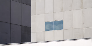
As part of this justification and 'credo', I add to this first one a recent picture about which I'm not dissatisfied: a bit of architecture from Almere, notorious as 'the ugliest town of the Netherlands', but it is highly photogenic! A couple of guys from our Fotoclub recently went there to take in the modern architecture; I for my part was inspired by .

What was the inspiration for this one? Sinplicity, I guess: just enough colour in the greys not te be black-and-white, and a mirroring of the clouds to break the straight lines of the architecture.