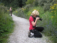
At the 'Midwinter fair', 12-13 December in theme park Archeon (Alphen a/d Rijn, NL), people paraded in fantasy and gothic dress. You're welcome to look at my Flickr-photostream for some examples of my snapshots. (Just click on the picture and you'll be taken there.) My best portrait, I think, was made inside, of this wood nymph, or was she a Maid Marian escaped from a Robin Hood story?
Taking pictures outside was a challenge--to put it mildly--because of the low winter sun and the high contrasts it created; high ISO-setting was needed because of the low light intensity overall, but the difference between sun and shadow sides of faces almost called for HDR solutions, which of course is impossible with moving targets (to keep with the bow and arrow inspired metaphors). I'm waiting for HDR-sensor chips in a next generation of cameras!
2009-12-21

2009-12-14
Want to see more photoblogs?
The Digital Photography School has a poll to ask if we, its readers, have photoblogs ourselves--and to give their web addresses. Of course I added mine to the list and maybe get more reactions? Would be a good reason to become more prolific again! I am not very satisfied with the few pictures I took in the last couple of weeks, but I might share a few with you: some suggestions for improvement would be nice! So watch this space in the coming days.
Besides: do have a look in the list of blogs that follows the poll: awesome stuff to be found there!
Besides: do have a look in the list of blogs that follows the poll: awesome stuff to be found there!
2009-11-12
Lightroom 3 makes a difference
 Lightroom 3 Beta does make a difference against version 2: one of my favourite photos of this summer was the dancer's portrait made with impossible light conditions and impossible camera settings: ISO 6400--the highest sensitivity on my Sony A700, so that noise ("speckles") was guaranteed. Nevertheless, I liked the result and put it into this blog on 2 Sept. ("Beauty in 36 Months"). But now I re-imported the picture from its RAW form into LR3-Beta and lo and behold, the noise level was already lower on the rough import and after using the Noise reduction option it got even better. Maybe the dancer did not need that many speckles to be a nice photo after all.
2009-11-07
Shanghai is some sight
 Couldn't access my blog while in Shanghai, but luckily photo cameras are not yet dependent on continuous web connections to store the photos (is that an idea for camera makers: no more memory cards, just direct upload to a web gallery?). Some are already on Flickr, but here's another one, symbolising how Shanghai is changing beyond recognition, even for its own (older) inhabitants! The 'rive droite' area, Pudong, was only rice fields twenty years ago, we were told, and now skyscrapers are mushrooming faster than rice could grow ;-)
The photo was a snapshot upwards to a higher level of walkways along the river boulevard, giving a great perspective and at the same time giving the contrast between the people's amazed expressions and the all-too-modern (for them, it seems) buildings in the background.
2009-10-27
Lightroom 3 beta is around
While I'm still enjoying (and learning!) Lightroom 2, version 3 is already in the making. A public beta has been made available by Adobe, Jeffrey Friedl told in his blog a few days ago. It should allow easier publishing of collections, rather than through plug-ins (although Friedl has already updated his for LR3!), but also export of slideshows.
At least as important may be the promises of still better handling of imported pictures: for instance reduced noise. (That is one my my issues with my Sony A700 camera, so I'm going to download LR3-beta for testing!) But also the opposite: film grain effects.
At least as important may be the promises of still better handling of imported pictures: for instance reduced noise. (That is one my my issues with my Sony A700 camera, so I'm going to download LR3-beta for testing!) But also the opposite: film grain effects.
Making good on my promise, interlude
I have to apologize to the Japanese Acer palmatum in my garden, because it is no longer dull brown: it just took its own sweet time to turn fully red. Maybe I can take some pictures of its autumn colours later this week. Timing is of the essence!
2009-10-25
End of summertime
 Now that in Europe the clocks have been turned back to 'normal' time, this photo is quite fitting: it was made during the summer time but is about nights--and we sure will have long nights again between now and March 2010.
 Photographer's dilemma with this photo: what is the 'right' colour temperature? Lamp light is not as white as daylight. Lamplight is about 2800 K, daylight 5500 K on a sunny day. If you keep the white balance of your camera to daylight, the lamplight and all else will be awfully yellow. If you take the lamplight as 'white' as any RAW-converter will let you do, much of the nighttime atmosphere disappears. My solution: Just try some settings in between the two extremes until you get a satisfactory impression. The disadvantage of tampering with white balance is that you cannot really say that your photo has 'real' colours. Then again: your eyes and brain make adaptations to interpret different light settings, so why cannot you do the same in your post-processing of photos? That needs a well-calibrated screen on your computer, of course, but that is a different story.
Photo taken in Piran (Slovenia, Sept. '09).
2009-10-19
Making good on my promise, part 2
 I had my eyes open for autumn colours, but somehow this autumn the trees seem to go brownish without too much good colour. Even the Acer palmatum 'Osakazuki' and the Amelanchier in our garden, put there because they usually have great autumn colours, are disappointing a bit this year. Only with the benefit of backlight and the 'golden hour' before sunset do the photos come close to what I had hoped.
Only the little Fothergilla major is making good on its promise of delivering autumn colours even in this year. Yes, there is a paradox in having a little Fothergilla major, but in Friday's Gardeners' World the presenter also remarked that hers had stayed much smaller than she had hoped, just like ours. But just like her, we can rejoice in being able to look down on all those fiery-coloured autumn leaves :-)

2009-10-17
Better watermarks in Lightroom: Mogrify Plug-in
Here's one for conservative Lightroom users like me. The real buffs, who are at home in all the blogs, in Adobe's exchange site for LR-plugins, etc., have undoubtedly known this for a long time. And if you don't use Lightroom at all, this is abracadabra--but please come back to my blog next time!
For the few of us then, one of the very few nagging discomforts about LR2 is that there is no way to control the watermark you add to the photo upon export: it sits in the left corner, in a fixed font and size. Of course you can go to Photoshop or use external small applications (shareware or freeware!) to add textual or graphic watermarks to jpg-files after exporting, but that is too much of a hassle: we want more elegant, user-friendly solutions. And finally I found one--as the real buffs know since a long time. One Timothy Armes developed a plug-in for LR that lets you add watermarks but also borders and frames in one go while doing the export! The watermarks can be text, self-written or taken from the photo's metadata, or graphic, and you can control the font (in a somewhat awkward way, for Mac-users at least, but it works) and where it is placed. Once installed and once you have designed your watermark, it will be used automatically for all exports, unless you turn it off again: 'fire and forget', really easy!
The multipurpose plug-in is called LR2/Mogrify and can be found in the Photographer's Toolbox; a Dutch-language, extended explanation was published in April 2009 (I'm really behind!) in DigitaleFotografieTips. The plug-in is 'donationware' and I guess that after a little more testing, I am going to make a donation to Mr Armes indeed: it seems to be worth more than whatever is a reasonable donation.
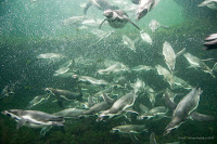 I felt, then, as if there were millions of beautiful penguins out in the sea of Plug-In and I just caught one nicely on my camera--just like the penguins in the Noorderdierenpark in Emmen (NL). And yes, if you look closely, there is a different watermark, in the right-hand corner, and somewhat less obtrusive than the standard LR2 one.
I also tried Mr Armes's LR2/Blog export plug-in; the entry on Berlin that I made earlier today, was made with it. But that one I found not useful: it may make it easy to upload a photo and add a little bit of text in a single go upon exporting from LR. However, you can only make simple unformatted text and also you cannot control the lay out of the photo in the blog entry. That was too limited to me, but if it's enough for you, have another look at the Photographer's Toolbox site.
For the few of us then, one of the very few nagging discomforts about LR2 is that there is no way to control the watermark you add to the photo upon export: it sits in the left corner, in a fixed font and size. Of course you can go to Photoshop or use external small applications (shareware or freeware!) to add textual or graphic watermarks to jpg-files after exporting, but that is too much of a hassle: we want more elegant, user-friendly solutions. And finally I found one--as the real buffs know since a long time.
 One Timothy Armes developed a plug-in for LR that lets you add watermarks but also borders and frames in one go while doing the export! The watermarks can be text, self-written or taken from the photo's metadata, or graphic, and you can control the font (in a somewhat awkward way, for Mac-users at least, but it works) and where it is placed. Once installed and once you have designed your watermark, it will be used automatically for all exports, unless you turn it off again: 'fire and forget', really easy!
 The multipurpose plug-in is called LR2/Mogrify and can be found in the Photographer's Toolbox; a Dutch-language, extended explanation was published in April 2009 (I'm really behind!) in DigitaleFotografieTips. The plug-in is 'donationware' and I guess that after a little more testing, I am going to make a donation to Mr Armes indeed: it seems to be worth more than whatever is a reasonable donation.
 I felt, then, as if there were millions of beautiful penguins out in the sea of Plug-In and I just caught one nicely on my camera--just like the penguins in the Noorderdierenpark in Emmen (NL). And yes, if you look closely, there is a different watermark, in the right-hand corner, and somewhat less obtrusive than the standard LR2 one.
I also tried Mr Armes's LR2/Blog export plug-in; the entry on Berlin that I made earlier today, was made with it. But that one I found not useful: it may make it easy to upload a photo and add a little bit of text in a single go upon exporting from LR. However, you can only make simple unformatted text and also you cannot control the lay out of the photo in the blog entry. That was too limited to me, but if it's enough for you, have another look at the Photographer's Toolbox site.
Missed hoped-for chance: Berlin in the rain
Berlin is a great city for photos of modern (and restored neo-classical) architecture. But that needs good weather, or at least dry weather for the buildings to appear at their best. Last week I was there, with some extra time, and even with a special travel guide for architecture fans (on sale in bookshops all around the city). But it was cold and rainy--as I wrote to some of my readers before. Instead of a nice set of photos, almost the only thing that came out was this contrasting view of the TV tower at the Alexander Platz and a church spire: Who comes highest? Is TV more important than religion (maybe that was an intended message in DDR times)? And what does it mean that the TV tower disappears into the clouds?
2009-10-10
Robert Capa's Dead Soldier: Truth or Fame?
The solution to the question if Robert Capa's iconic picture of a Loyalist soldier dying in the Spanish civil war in the 1930s was true or false was the subject of an article in the Dutch newspaper NRC Handelsblad on October 9 (the article itself is not in the public part of the website--sorry!). It was a long article, so the answer was not simple.
First of all, the answer did not come from the 'Mexican suitcase', the suitcase full of negatives made by Capa that surfaced in 2008 in Mexico. The negative of the famous photo was not there; it has been missing for years. Second, the state of the art on this question will forever remain a matter of debate between experts and would-be experts. It is, so much we can take from the discussion, probably not a photo of a soldier dying in a large-scale action. Probably Capa went on a small tour with a group of soldiers for a photo shoot; it was a staged photo. Some stories have it that the man in the picture was shot by a sniper at the moment Capa pressed the shutter--to my mind too good a story to be true. It was said that Capa himself never claimed it was a picture 'at the moment of death'.
The impression of authenticity of the photo may have been a trick: Capa may have made a slightly unfocused photo on purpose (no autofocus in those days, of course!), and moved his hands a bit to give the impression he himself was diving for safety while pressing the shutter.
And then there is the role of the press. Capa's picture was first published September 1936 in two French magazines, Vu and Regards. In Vu they published a whole series of the young photographer (he was 22 at the time and not yet famous) with poetic, symbolic captions going with the photos. When the same picture was republished later in world-famous magazine Life in the USA, July 1937, there was a much more dramatic caption, talking about the photo being made at the moment the soldier was killed. Being published in Life, and with such a dramatic caption, were the occasion for Capa to become world-famous--and he did not say that the caption going with his photo was not truthful. He did not even lie, he just did not tell 'the whole truth'. What would I have done--what would you have done--if fame suddenly beckons?
Footnote: the picture can be found on many websites so have a look at Google or better the Wikipedia if you do not know it, but is copyrighted.
2009-10-06
Making good on my promise, part 1
 This weekend I began making good on my promise to do some photos of autumn colours this time. Hopefully some more stunning ones will follow in future instances, because there are not many colouring trees yet. But for starters, this was not too bad. I liked making the discoloured leaves not the single subject of the picture (going against my own precept of simplicity), but putting them in "by the way" in a picture of the "other-worldly" form of the flower-base still standing on our Cornus Nuttallii.
 Looking around for more coloured leaves, form caught my eye instead of colour. Hence the second photo, of the walnut in its bolster. Natural symmetry.
2009-10-04
Mediterranean colours: Sun on the Stairs
Been on a trip to Istria (Slovenia, Croatia, on the Adriatic coast) last week and just recovered from it--physically OK again and photographically still very impressed. It all shouts colours. Even the photos I envisaged as black-and-white ones look better in their original, colour form!

2009-09-23
Doubling by halving: f/1.4 instead of f/2.8 and artistic sense
Jeffrey Friedl's most recent post was about a French photographer and author, Stéphane Barbery, who borrowed Jeffrey's camera for a while because he wanted to enjoy 'a thin depth of field with my Nikkor 85mm f/1.4 that his current camera can't match.' That's even less of depth-of-field, or more selective sharpness, than f/2.8, especially with Jeffrey's full-frame camera! By halving the aperture number, the selectivity of sharpness is doubled--as a figure of speech.
Are those lenses more affordable in Japan, where he lives, or is he just fanatic about maximum light and miminum depth-of-field? Anyway, it makes me jealous--not because of the price or the weight (both must be tremendous), but because of the photographic possibilities it gives.
What also makes me jealous is how this Stéphane Barbery has a very different sense of photographic beauty. Friedl discusses a 'throw-away test shot' that Barbery made and that he finds beautiful. So did I. Have a look here; it also gives links to Barbery's web site--worht a look too!
2009-09-19
Other autumn pictures
 My autumn depression is not as bad as yesterday's entry suggested: I may not have autumn colour photos, but the other typical autumn subject in nature is present in my photo collection: mushrooms and toadstools. Though I don't know the difference between the two. My dictionary says mushrooms are the edible kinds, toadstool the poisonous ones--never mind, I'm not going to collect any; two-thirds of the species in the Netherlands are on the Red List of endangered species. You can enjoy their beauty by watching--and photographing of course!
The photo, made in Holland a few autumns ago, may be of a mushroom called Oudemansiella mucida (synonym: Collybia mucida, teaches the Dutch part of the Wikipedia). I made a close-up with selective sharpness (f/4.0) to emphasise the fragility and the subtle colour; not for nothing the Dutch name would translate as 'china/porcelain mushroom'.
One thing had to be retouched, I admit: there was a bit of cobweb hanging from the hood which I clone-stamped away in Lightroom (who needs Photoshop?). Forgotten to 'look around' my subject when I took the picture! But if I hadn't told you, you would not have known, would you? If you find the spot where this photo was retouched, you earn a bottle of wine. Come and get it! ;-)
2009-09-18
Ready for those autumn colours
Good tips to make photos of autumn colours just that little bit more intense and interesting, I found in the Digital Photography School.
Flipping through my photos for a fitting illustration of this link, I discovered that I have no nature pictures expressing autumn. Do I suffer from unconscious pictorial autumn depressions? (Wonder what my physician would say about that description of symptoms.) Well, no more now: I must make that ultimate autumn colour picture this year!
Flipping through my photos for a fitting illustration of this link, I discovered that I have no nature pictures expressing autumn. Do I suffer from unconscious pictorial autumn depressions? (Wonder what my physician would say about that description of symptoms.) Well, no more now: I must make that ultimate autumn colour picture this year!
2009-09-17
One in a million
 There are about 1 million active weblogs around on this planet. Or a bit more: 1.5 million, in fact. That's a guess (as Katie Melua sang about the size of the universe), calculated from Technorati's claim that from 133 million blogs (end of 2008) 1.1% had been updated in the week before their survey. So there is way less than one in a million chance of your finding this blog of mine--taking things purely statistically.
 (Statistics from NRC Handelsblad of 2009-09-16.)
I'll keep going though, hoping that you'll find this place for non-random reasons!
So just for your pleasure, a random photo on my blog's theme. Here are two Greek beauties from the national history museum in Athens--showing that beauty is timeless, even though different across time ;-)
2009-09-13
Sunflower patterns
 Harvest of the sunflowers. Most are to be kept for the birds, coming winter (if we are advised to feed them again; at the moment, because of a contagious bird disease, we'd better not stimulate their getting together). But birds don't wait: some of the flowerheads were already mostly eaten (first picture).
For photographers (and mathematicians!), sunflowers are irresistible because of the patterns that the seeds make in the flowerhead. And as usual: patterns come out better if your eyes are not distracted by colours, so the second picture comes in black-and-white.

2009-09-12
Dundalk, earlier this year
When selecting photos for the camera club's next meeting, I stumbled upon this one. I had forgotten about it, and won't show it there, but still I think that the play of hard but curved lines is kind of neat, especially in black-and-white and, even more especially, because the curves and diagonals of the empty street are contrasted--maybe you should even say they are 'broken' by a few verticals coming from the bottom of the picture. First there is the lantern, which still belongs in the man-made hard landscaping. But then there are the three young trees. Still leafless (it was early spring), and vulnerably small. The black-and-white makes the picture a bit ominous, to my mind: will these little trees survive? Yet the natural forms against the hard lines seem to say that nature will not be subdued! And if you then look closely, there is more of nature in the picture: more planting at the bottom, and some wild grass (you cannot call it a lawn) in the top-right corner. There is hope.

2009-09-09
Close to f/2.8
The closest my standard lens comes to selective sharpness is f/4.5, so that's what I used here.
The "composition" of the still life is just as they happened to be lying on the table. It is almost a matter of principle to me that I take reality as given and do not interfere to make compositions "better" than what fate gives me. Exception: blades of grass or dead leaves and similar small things that I can easily take away.
Looking at the photo, I don't like the horizontals of the courgettes in the middle: they break the dominant verticals in the composition, and therefore take attention away from the area of sharpness, more in the foreground. Though that is a little better in the original large-size photo: there you see that the courgettes are really out of focus and the sunflowers stand out very clearly (or rather: sharply) from the dark-green background. (That effect is one of the reasons why you should never judge photos in the small screen on the back of your camera: sharpness and bokeh are very different in the original size.)
2009-09-05
Between f/2.8 and f/64 (2): Mr. 2.8
You can overdo with selective sharpness at f/2.8. Another of my favourite bloggers, Jeffrey Friedl, always uses f/2.8, it seems.
Did I mention Jeffrey Friedl before? No, I did not, I believe. He is an American who lives in Japan, and who is an avid amateur photographer--if he is an amateur, that is. For like a professional he seems to be taking photos full-time, and of everything, though he is especially good at landscapes—Japanese landscapes are good anyway and he makes them even better! He uses f/2.8 to make a subject stand out clearly from the background, and his professional lenses help to make the bokeh especially good: the number of blades in the diaphragm and their curvature seem to play a role in making the gradient from sharp to un-sharp as well as the rendering of un-sharp objects without irritating double contour lines and the like.
I came across Mr. Friedl when I looked for a smart way to upload photos to Flickr from Lightroom, and the official Adobe Lightroom website linked to his plug-in. Jeffrey Friedl proved to be a real Lightroom buff, who published all kinds of upload plug-ins, for all (well, almost all) kinds of photo sites. Once you know the trick, it's probably not so difficult anymore. Besides, his real profession is in programming. The Flickr upload plug-in was worth all its money (which was not much)--and more! It works really handy, once you have followed the (very clear) download and installation instructions from Mr. Friedl’s site.
As I said, he uses f/2.8 all of the time: check his blog full of photos, under each of which he neatly gives the essential statistics of time, aperture and if you drill down a bit also location(!). If nothing else, you can find a few nice wallpapers among his collection (watch out, that page takes some time to download!). But I wanted to make a little bit of fun of this Mr. 2.8. Once he wanted to take a group picture of a bunch of children and he was frustrated at not getting them all in focus at the same time. The examples he showed a few days before, again gave the statistics: f/2.8 most of the time. In the final one he used f/5. If he had simply gone down a few stops to, say, f/8 (the aperture at which many lenses have their optimum resolution and sharpness), the whole group would have been in focus from the beginning even though kids tend to move a lot more than landscapes—no problem at all! Even good photographers may forget their basics for a moment, sometimes… As long as you remember in the end!
Between f/2.8 and f/64 (1)
At Earthboundlight a blog entry appeared this week to answer a reader’s question: ‘Why would you want to have an f/2.8 lens?’ Bob Johnson, the author of Earthboundlight, looked at this question from the landscape photographer’s point of view. In Ansel Adams’s days, with the big plate cameras, you needed f/64 to get the ‘grand vistas’ sharp from front to end—that’s why Ansel Adams was member of the Group f/64. Current lenses ‘only’ go to f/22 (sometimes f/32), so landscape photographers tend to use those small apertures—and a tripod, because you get long exposure time at small lens openings. Luckily landscapes tend to stay in place long enough ;-)
 What Johnson did not say was that at smaller formats, you get the same depth-of-field at lower aperture numbers. That is why it is so easy (relatively!) to make macro photos with compact cameras: with their tiny sensors, they get that flower detail all sharp at full opening, where a DSLR (especially a full-frame one) must stop down to f/22 to get the same. So for a landscape to be sharp from foreground to horizon, you can make do with f/22 rather than f/64 on a DSLR—if you want it all sharp.
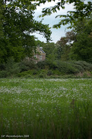
It gives a classical look to—especially—landscape photos to have them sharp all over. Give it a sepia toning and you’d almost believe it was a 19th century picture! But most of the time, you don’t need sharpness all over to get the effect you want: selective sharpness is much more creative. You don’t need that grass and branch in the foreground to be sharp for them to have the effect of suggesting more depth to the photo with the manor house in the background.
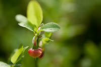
Selective sharpness also works in close-up photos: this minuscule blueberry flower was all you need to see sharply—it conveys the spring feeling much better with the strong bokeh (‘unsharpness’) than a picture bewilderingly full of sharp details would have done.
 Both these photos were taken at f/2.8—I only have one lens that opens so widely. The wide aperture has the advantage that you get more light into the viewfinder, so you see more clearly and you (or the camera) can focus more precisely. Moreover, f/2.8 often signals professional lenses, which also have other advantages, like minimum distortion of straight lines, minimum flare, minimum chromatic aberration and other flaws. Their only disadvantages are weight (that kept me from choosing one as my standard lens)—and price…
 What Johnson did not say was that at smaller formats, you get the same depth-of-field at lower aperture numbers. That is why it is so easy (relatively!) to make macro photos with compact cameras: with their tiny sensors, they get that flower detail all sharp at full opening, where a DSLR (especially a full-frame one) must stop down to f/22 to get the same. So for a landscape to be sharp from foreground to horizon, you can make do with f/22 rather than f/64 on a DSLR—if you want it all sharp.
It gives a classical look to—especially—landscape photos to have them sharp all over. Give it a sepia toning and you’d almost believe it was a 19th century picture! But most of the time, you don’t need sharpness all over to get the effect you want: selective sharpness is much more creative. You don’t need that grass and branch in the foreground to be sharp for them to have the effect of suggesting more depth to the photo with the manor house in the background.
Selective sharpness also works in close-up photos: this minuscule blueberry flower was all you need to see sharply—it conveys the spring feeling much better with the strong bokeh (‘unsharpness’) than a picture bewilderingly full of sharp details would have done.
 Both these photos were taken at f/2.8—I only have one lens that opens so widely. The wide aperture has the advantage that you get more light into the viewfinder, so you see more clearly and you (or the camera) can focus more precisely. Moreover, f/2.8 often signals professional lenses, which also have other advantages, like minimum distortion of straight lines, minimum flare, minimum chromatic aberration and other flaws. Their only disadvantages are weight (that kept me from choosing one as my standard lens)—and price…
2009-09-02
Beauty in 36 Months
If, like me, you are interested in what makes beauty in a photo, you're obliged to buy Dutch photography magazine Focus for the next 36 months. For they started a new series of one-page columns called 'beauty for the advanced'. Hopefully a bit tongue-in-cheek the introduction states: 'The experience of beauty in photos is complex. After much research it appears that 36 elements are important for it. Usually in combination.'
 Element number one is: focus, or rather out-of-focus. Out-of-focus photos suggest things, stimulate the viewer's phantasy. And they say a couple of other things about unsharp pictures, all true and interesting. But then the paragraph ends on: 'This is perceived as artistic.' Is this serious? Is it Flemish-Dutch (the columnist might be Flemish--I don't know)? Or is it ironic: who would want to be accused of being perceived as artistic? I don't know what to make of this column, but I will follow it for the next 36 issues--I subscribe to the magazine anyway.
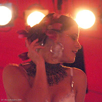
And it inspired me to show you this photo: taking the idea of 'unsharp' in a slightly different manner, this portrait of a belly dancer at the Sonsbeek Theater Avenue, last month, is no out of focus, but as it was made without using a flash, there is some unsharpness due to the dancer's movement. Besides, there is unsharpness because I used a high ISO setting (6400, to be precise) which gives visible specles. Does this make her more 'symbolic', 'not THAT woman but THE woman'? Beauty?
 Element number one is: focus, or rather out-of-focus. Out-of-focus photos suggest things, stimulate the viewer's phantasy. And they say a couple of other things about unsharp pictures, all true and interesting. But then the paragraph ends on: 'This is perceived as artistic.' Is this serious? Is it Flemish-Dutch (the columnist might be Flemish--I don't know)? Or is it ironic: who would want to be accused of being perceived as artistic? I don't know what to make of this column, but I will follow it for the next 36 issues--I subscribe to the magazine anyway.
 And it inspired me to show you this photo: taking the idea of 'unsharp' in a slightly different manner, this portrait of a belly dancer at the Sonsbeek Theater Avenue, last month, is no out of focus, but as it was made without using a flash, there is some unsharpness due to the dancer's movement. Besides, there is unsharpness because I used a high ISO setting (6400, to be precise) which gives visible specles. Does this make her more 'symbolic', 'not THAT woman but THE woman'? Beauty?
2009-09-01

2009-08-30
More on show: projector problem
Data projectors ('beamers' in our corner of the Continent) are tricky enough even when not miniaturised into photo cameras (see previous post): during our Club evening, yesterday, I counted on using the room's built-in projector with the special settings we had laboriously made for it. In fact, Louis and me had spent the best part of two hours fiddling with all settings and had stored our best (i.e. reasonable, not perfect!) settings. Friday night I loaded "our" settings, but when we watched and discussed forty or so photos over the evening, the bad rendering of colour and contrast on the screen made serious photographic discussions quite difficult. And then to think that this ASK Proxima was judged to be one of the best of the € 1,000 projectors, a year ago by Focus. What is the solution? Should our camera club buy its own projector, of € 3,000? Unlikely--but if not, what then to do?
2009-08-23
Compact to show
I'm a bit behind on the camera release front, and no wonder (I soothe myself), because new cameras are announced almost daily. But this one is worth noticing: early August, Nikon announced a compact camera with built-in projector. It should give you a view of up to 40", instead of the 2 to 3" screens at the back of compact cameras before which we now have to rub our heads with other onlookers to get a faint idea of the new baby, or whatever people take pictures of. I like the idea of being more aware of the fact that photos are there not just to be taken, but to be viewed. Viewing should be made as simple as possible--quite in agreement with Nikon, and also with other camera makers who let you upload seamlessly to web galleries and social network sites. But will this built-in projector work?
There are some drawbacks. Not the 40" maximum size; that's more than most home tv screens. But that is the maximum, probably only reached under ideal circumstances (no disturbing environmental light, a good flat and white background, I guess). Besides, your tv nowadays has up to HD resolution (1920x1080 pixels, about 2 megapixel--still less than modern phone cameras, let alone good compacts or DSLRs), while this camera-projector is said to have VGA resolution; that means 640x480 or 0.3 megapixel. That won't look good at 40" size, not even if you take the larger viewing distance into account. (The relevance of viewing distance: People look at a small-size picture from a small viewing distance, so it needs a higher resolution to seem sharp than a large-size picture, which they need to step back from to take it all in at a single viewing.)
Besides, I wonder about the colour rendering of the small built-in projector. In our camera club, we worked for close to two hours with a normal-size projector to get its colours more or less right by tweaking all kinds of menu settings against a number of test pictures, from colour cards to 'real life' photos including landscapes, portraits, etc. (No, we don't have a calibration apparatus for LCD projectors--but that's another sad story.) And that was with a fairly new projector already in use, which had been installed by a professional seller and which the non-camera club users found quite alright and convincing as for its colour rendering.
I don't want to forget to mention that the battery time for projecting would be no more than one hour. Probably that's even quite a feat, technically--and more than enough for the slide shows you want to submit your family and friends to. Maybe they should have limited slide show duration to twenty minutes, for the sake of the family and friends ;-)
All in all, Nikon had a good idea, but I'm sceptical as to its practical use. I'll wait for the third generation of such cameras-cum-projector. At least the third generation.
2009-08-22
Every so often... you just have to take that picture

"Every so often, you turn a corner and there it is--a great photograph." That is how Guardian photographer Eamonn McCabe summarised his fascination with (black & white) photography. He felt inspired by a book of the same title, Every so often, by another photographer, Raymond Moore. It's a matter of (quoting McCabe's column in August's Black+White Photography again): "just enjoying the process of looking". I agree, and whished I had a camera built into my eyes: you just click your fingers (that is an allusion to a recent song by Daniel Lohues, of course) and then it's stored in your memory. So even when I don't have a good camera with me, sometimes I just have to take that photograph--as this one, in the streets of Athens, in 2007. What did that junk do in the street? Why is the passer-by looking at it, or beyond it through the window? Never mind the technically bad quality of the photo, use that little old compact (as in this case) or even your phone's camera. Point and shoot--to keep wondering whenever you see the picture again about a moment you otherwise would have forgotten.
2009-08-16
Landscape book -- little gem with flaws
A book on landscape photography is what I picked up in a 'modern antiques' bookstore ('ramsj', in Yiddish-Dutch), when my daughter drgged me into it. (A matter of self-protection, as I would be certain to come out with too many books if I let meyself loose in such a store...). It was the Dutch version of 'The World's Top Photographers - Landscapes' edited by Terry Hope. You may find little gems among the rubbish of those cheap bookstores, so do go and have a look--if you can control yourself ;-)
The book itself is still on sale in the main online bookstores (no advertisements by me; you can find your own).
It contains two spreads with a little bit of text and one to circa four photos from 38 photographers, ordered alphabetically. The photos are quite nice--'inspiring' in the not too far from true enthusiastic parlance of the Introduction--and the texts give a good impression of what it takes to be a good landscape photographer. Knowing your special corner of the world and a lot of persistence are among the key ingredients, so much is clear to me already after leafing through just a few of the photographers' little chapters.
It is only too noticeable that the book originally was published in 2003, before the digital revolution in photography. All photos are made on film (almost invariably Fuji, just a few on Kodak--I used to prefer the fuller Fuji colours, too). Of course, there still are many landscpae photographers who work on film, especially in the large cameras (4x5 inch, etc.). But many now also work digitally, and that is not found in this book. Besides, I would have liked more detailed technical information with the photos: what is the use of knowing the brand of camera or film, but not the aperture and shutter speed (plus ISO setting)? For instance, the trick of getting the 'glazed' smoothness of the sea in some photos depends on the shutter speed and then I'd like to learn if it takes 2, 20 or 200 seconds for getting that effect.
 Annoying about the Dutch translation is that it was not done by a photographer, otherwise the translation of 'tripod' would not have been the literal 'driepoot' but the correct 'statief', for instance. So I found the book a gem with little flaws, but it will be useful on many rainy days for getting more inspiration!
The photo here is just a little illustration of landscape and nature photography 'learned young'. As my daughter had my DSLR, I took her picture with the small compact camera--good enough for the purpose. I tried to take care of some composition rules (object at 1/3), and felt aided by the S-curve in the park's path to suggest depth. What's the flaw in this little gem?
2009-08-09
Pokeweed revisited with bonus
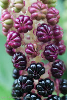
Looking at the same spike of the Pokeweed that I showed here a week ago, it looks quite different now (overview of the plant below), with all berries that were ripening last week already disappeared (eaten by birds?) and the last few, at the top of the spike, blackening now. But the bonus this time was the orange ladybird (there must be umpteen kinds of ladybirds!) scourgng the little berries for aphids and the like. Problem for the photographer: such a little insect is faster than you think, and it always seems to sit at the wrong side of the spike.
Info for other photographers: although this photo was made in subdued daylight (it was a cloudy day), I used a (normal set-up) flash to get the highlights. More importantly: the flash enabled using a short enough shutter speed to avoid blur due to the wind.
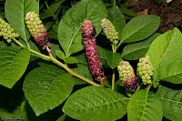

Info for other photographers: although this photo was made in subdued daylight (it was a cloudy day), I used a (normal set-up) flash to get the highlights. More importantly: the flash enabled using a short enough shutter speed to avoid blur due to the wind.

2009-08-08
Hazy Sunday morning
Found the new issue of 'Black & White Photographer' with quite a few landscape pictures (almost all of seaside locations on the British isles). That inspired me to play in Lightroom with a picture of earlier this year, and which has some water--no seaside in my neighbourhood, a ditch is all you can find here! But then again, with a few wild ducks and the haze of a Sunday morning in spring, what more do you need?

2009-08-02
Sensible suggestions: Photographing dragonflies

The magazine Vlinders of this month (3/09, the journal of the Dutch butterfly foundation—they also include working groups on dragonflies and the like) has an article on photographing dragonflies by Kim Huskens, from which I’d like to copy some of the many[!] sensible suggestions.
Camera talk
Apart from the usual arguments about technical pros and cons of DSLR’s versus compact cameras, they include some things specific to photographing insects and especially the fast-flying types, such as dragonflies.
Starting with flying fast: you need a camera that reacts very quickly, both when it comes to focussing and to the delay between pushing the button and the actual picture. Most of the time, DSLRs win out on these points from compacts. However, some of the newer ‘megazoom’ or ‘bridge’ cameras score very well on these points, too—Huskens does not mention those, and I admit I’m not aware of the state of the art either, but with 30+ pictures per second, or HD video options, you’d stand a good chance of capturing that dragonfly that the DSLR-amateur misses with ‘only’ 3-6 frames per second.
Another advantage of compact cameras lies in what often is a disadvantage: their small sensor. For that means they also have a large depth of field: you can make great pictures of insects in their environment and get a great view of the environment. Their disadvantage is of course that you cannot get that insect free from the optically disturbing background.
 For the rest of this blog, I am thinking of a DSLR, because now we get to changing lenses). Often, you’ll have to get close to get the beast filling a good deal of the screen/viewfinder. With special tele-macro lenses, you don’t need to get that close; with a normal 50 or 90 mm you’d have to get within a couple of centimetres of the target and they do not often wait for that… Bumble bees may sometimes be slower, early in the day or when they are cold, so the secon picture was made with a 50mm macro lens (thanks to the crop factor, that was 75 mm equivalent on a full-frame (D)SLR). The pictures in Huskens’s article were made with, I suppose, the famous Sigma 2.8/150 lens (she does not say if it is the current 2.8 version). For me with my Minolta/Sony stuff, there is the Tamron 3.5/180, with the advantage of a bit longer focal range. High on my wish list, because getting a dragonfly filling the viewfinder in real is better than using my 100-300mm at around 1.5 meter and cropping afterwards (as I did in the first picture here).
Making the picture
With insect photography, there are a few special things to think about. When you get close, you must take care not to cast your own shadow in the photo. Apart from losing a few stops of light, you’d scare off the dragonfly before you can press the button. So keep the sun behind you (for getting the detail of the animal) but not straight behind. Don’t try backlight.
Walk slowly and keep your distance while circling to a good angle. Huskens advises to get low, so that you don’t seem so big and threatening.
 For determining the dragonfly (if you can…): keep in parallel to the long body (not as in the third picture) so that it I sharp from front to tail. Often you need to see both the side and the top of the dragonfly’s body; sometimes you need two photos, then.
It helps to know the behaviour of the dragonfly: some families of dragonflies sit still quite a bit, others keep coming back to the same spot after short hunting flights, but there are also families that keep flying—obviously, those are the hardest.
Shoot first, ask later
‘Shoot first, ask later’ is one of my favourite one-liners when it comes to taking photos: when you see something promising, release the button as soon as you can, so that you have at least one memento of what you wanted to put in the picture. Only then begin to follow all the rules and tips to go for a good picture. Especially with dragonflies and the like, if you begin slowly, you may miss your one and only chance to get the beast at all.
Silly season is over, and so is the rain
The French just started their month of holidays, but I’m back again, back to photos and blogs! Hope you all are on the net, too!
 It rained this morning, but after the rain the diffuse light filtering through the clouds showed all details of the plants in the garden to their utmost advantage. Subtle colours on the Phytolacca esculenta (pokeberry) are my sample picture of that. These weeks I find the pokeberries fascinating with their berries changing from green to blackish-red.
The raindrops on the leaves make the sights in the garden even better. Alchemilla mollis (Lady’s mantle) is famous for the way it keeps drops of rainwater—or dew, for that matter—on its leaves for a long time. How come some kinds of plants do, and others don’t? No idea! But I do know another advantage of Lady’s mantle: it has short, stiff stems, so that the leaves do not move with every whiff of wind; I tried to take a picture of raindrops on fern leaves (to have something different than the eternal Lady’s mantle macros), but they would not hold still for long enough, even though there was just a tiny little bit of wind around the house.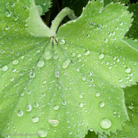

2009-06-07
Brief break
Sorry, folks, but let me first get used to my new computer; updates of pictures, hence also of this blog will have to wait for a bit. But it's days--not weeks. "I'll be back!", someone used to say ;-)
2009-06-01
On time zones and smart design
 When exporting the photos of the hotel atrium for the blog entry of last night, they were in "tomorrow's" date folder on the computer. I had forgotten to change the time in the camera. Now I brought just the simple compact camera, not the DSLR, and I don't know its menus that well. But it was easy to find time settings and I was completely surprised to see that it had the option of setting two time zones: "home" and "destination". Destination is sought by scrolling across a world map; no need to fiddle with hour settings at all. It's a breeze! In the DSLR I'd have to search through more menu pages and then would have to adjust hour settings manually.
 But even in the DSLR I still could DO it. In my so-called smartphone, I quickly returned to the European time settings, because when I changed the time zone, the MS-Outlook app decided that all appointments would have to be adjusted as well, completely spoiling the carefully-planned dinner meeting to midday, interviews to the middle of the night... Why would it assume that I made appointments in my home time zone if they were for an intercontinental trip?
Well, to compensate for that bit of frustration about not so smart design, I'll add another picture of the hotel atrium--still with the wrong time zone in its data, if you care to look them up :-)
2009-05-31
Amazing building: Atlanta Marriott Marquis hotel
 Little to say, but more to see in this amazing hotel I am visiting, the Marriott in Atlanta, Georgia. The atrium, stretching from bottom level to 50 floors up, almost defies taking into a single photo, and yet it is full of architectural motives, with the curves and not-quite-repetitions of positions of concourses and bridges.
  It all reminds me of a genteel version of Zion in the movie trilogy The Matrix. Even worse: aren't those closed doors and uninhabited galleries just like a prison? And another advantage of Zion over the hotel: it did not have such tacky colours in the carpets on the floors ;-)
2009-05-26
Sitting ducks and moving targets

Bumble bees may be among the slowest-flying insects, but it is not easy to catch them quite right! This weekend in the garden I tried, but the only reasonable photo is the one you see here. It takes a lot of practice, hi-speed photo bursts and still you need luck. Moreover, when concentrating on shooting the bumble bee, of course I forgot to "look around" my subject, so that now we have this distracting light-green blob of the day-lily's leaf in the background, precisely where it bothers most. And the so-called slow-moving bumble bee still was too fast a moving target for a sharp picture at 1/750th of a second. So much frustration hidden behind a photo that still is decent enough to dare and show it on the Web!

The second one, a dragonfly, is the sitting duck of this entry's title. A few minutes before, this dragonfly (or one that looked very much like it) laid eggs in the pond and I was too late to get the camera from the house. But tired of laying eggs, or just waiting for prey to fly by, it sat quietly on a reed and I could get close enough for a 'portrait'. Admittedly, I still had to crop the photo to avoid the 'Japanese flag' effect, because the tele-zoom has 1.5 meter as its minimum distance.
2009-05-21
Portrait workshop for kids was a success
 Yesterday I survived a workshop for kids in a creative class--the kids (my daughter being one of them) and camera survived as well! The idea of the class teacher was to have old-fashioned portraits of just the kids' heads; they would then cut the heads out, paste them on paper made looking old with diluted black ink and then draw or cut-and-paste old-fashioned clothes and attributes, all in black, greys and white. I gave a short introduction about differences between photography 'then' and 'now', and a little about ligth and shadow in portraits. Then the teacher handed round some copies from real old portraits (found on Flickr).
 It was quite nice to do, but the real fun started when I was busy quickly converting the photographed portraits to black-and-white and printing them (I love working with Lightroom!). For then my daughter got hold of my camera and started making modern portraits of her friends! They had gotten the message about differences between then and now, and they had fun taking pictures and modelling. Perhaps that fun with photos shoots was an even more important result than my portraits rolling out of the printer.
This time's picture is a slide from the presentation I made. You won't get to see portraits of children whose parents did not get a chance to agree to their pictures being published.
2009-05-16
Just some architecture
 Only nature, in the last weeks. High time for my other love: architecture. Clear lines, clear light--good old modernism in an airport building. The balance of verticals and horizontals is stressed by the square format of the photo--admittedly, to the left it got boring, so I cropped the picture. A person in the picture (an intrusion of nature?) adds a little movement and interest to the straight lines in almost monotonous grey, but remains a semi-silhouette. The man's lorry(?) has a few dashes of red, drawing attention to the man, but more than that also making a "warm" statement near the person, counterbalancing the few cold, blue accents in the architecture.
2009-05-10
Yvonne van der Mey wins with photo "against the rules"
.jpg) Yvonne van der Mey, who directed the workshops on nature photography that I followed the last two weekends, won a prize! The prize photo, entitled "Leopard male in the early morning, desperately looking for a female" she had shown to us during the workshop as one with which she was quite satisfied, although it went against a primary rule of composition, namely that you ought to see the subject's eyes in a portrait-like picture. But here, clearly, that rule does not really apply: we as viewers are following the leopard's gaze into the depth of the unknown, almost feeling his anxiousness.
Yvonne van der Mey, who directed the workshops on nature photography that I followed the last two weekends, won a prize! The prize photo, entitled "Leopard male in the early morning, desperately looking for a female" she had shown to us during the workshop as one with which she was quite satisfied, although it went against a primary rule of composition, namely that you ought to see the subject's eyes in a portrait-like picture. But here, clearly, that rule does not really apply: we as viewers are following the leopard's gaze into the depth of the unknown, almost feeling his anxiousness.That's a point about so-called rules of composition: you have to adhere to most of them to avoid mistakes in your photo, but you must know when to break one of them to make a truly good shot.
By the way, I wonder if the title of the photo was really true: maybe the leopard was just looking for food, or was frightened through hearing a pride of lions roaring, rather than being on the lookout for a mate, but it is a nice title that adds to the picture's meaning--it makes the animal more symphatetic to human viewers, and if that's what gives you a prize, why not?
2009-05-04
Black-and-white in colour, or a dandelion and levels of meaning
 Conventional wisdom has it that photos of patterns and structures are prime targets for black-and-white. The dandelion of this week's blog was precisely such an object, I thought when taking the picture, but when I saw it on the computer screen, I did not change it from its original colours. The brownish, unfocused background adds something to it. Without this collective of seed ends in their original colour, I found the photo too abstract, too much shouting out that it wanted to be an artistic photo rather than a real picture of a flower. Now, with colours, I think its artistic value is more subdued--and heightened by that very fact. It now is a photo with two layers of meaning (at least): the seedhead itself and the pattern of star-form lines.
At a third level of meaning--if you want to go that far--the colour photo is a symbol of the transience of life, precisely because it refers more clearly than the black-and-white version to the seedhead itself. For the seedhead is destined to let go of the seeds at the first wisp of wind, of course.
 The second photo here was not quite as good as the first one (in my eyes) for technical reasons: it lacks depth-of-field in the centre. But it help illustrate the point: this one, although also a close-up and also playing with the star-form patterns, is obviously a dandelion even in black-and-white and does not lose its layers of meaning by the reduction of colour to black-and-white.
 By the way, you can see I am influenced by having begun to read a book I just bought: Jeffrey, Ian. 2008. How to Read a Photograph: Understanding, Interpreting and Enjoying the Great Photographers. London: Thames & Hudson. He finds so much more meaning in "simple" pictures, that you almost start to think your own photos have meaning(s), too ;-)
2009-04-26
Light through the beeches
 Never knew I was such a springtime person, but there are so many things to take pictures of, this year! For the first time in my life, I did a photography workshop--cannot call myself "autodidact" any more. That makes me a bit sad, but that's a joke! It taught me a couple of errors of composition in the samples I brought, but more importantly, we went out to photograph the woods on the Veluwe. Sunlight filtering through the young leaves of a beech tree must be one of the best things you can see.
Cool software: Cooliris
 For viewing pictures on the net in a very cool layout, as if you have a 3-D photo (and video) wall, an add-on exists for the Firefox web browser. And for Safari, for the iPhone, for Linux... in short, for almost all of us except for who stays with slow and cumbersome MS-Explorer ;-) That is Cooliris. Some time ago, an update was launched that also works with the pictures on your own computer! Very cool software indeed, as the picture here shows.
Cooliris is only a browser, so it cannot replace your Irfanview, which has conversion and archiving options (to name just a few), let alone Lightroom. But it is so fast & cool-looking!
2009-04-18
Learning shortcuts takes time... but will be worth it!
Some time ago I downloaded a Lightroom plug-in by Jeffrey Friedl to integrate uploading photos to Flickr into the export menu. Note: the first hyperlink is to the plug-in, the second to his blog--a must for Japan photo lovers! You can also click here for the plug-in.
 It took a lot of hassle to get it going--whether that be my incompetence or the complexity of the chain of software...
First, you must find out that you need Lightroom's "Plug-in Manager" (lower-left corner of the LR export menu screen, see the image right here) to install the thing.
Then, you have to find out that the plug-in does not automatically show in the export menu, but has a separate "header" (see the upper-right part of the picture).
Third hurdle: it takes some figuring out when exactly to log onto your Flickr account: before you start the export, in order to get the authentication process right.
It took me quite a number of tries, I admit, but when all is right, things go quite smoothly and it runs as smooth as a well-oiled bicycle. No more hurdles: the photos are online! It really is a shortcut now, from LR to my photo stream on Flickr in one go.
And at the same time my 6-week trial period is over... OK, I feel ready to register now (though that is not quite for free; the plug-in is "donation ware" or restricted to 10 photos at a time. Take your pick!).
2009-04-12
Magnolia in Spring--Far to Go to Reach Imogen Cunningham
 Really irresistible, this spring: temperatures are much above normal since some time and all plants and flowers are just exploding! After a day of hard work in the garden, the magnolia tree looked gorgeous in the sunset. Even better is the purity of a single magnolia flower in close-up. But a snapshot like mine is far from the perfect photo Imogen Cunningham once made of a magnolia--I swhowed her photo a long time ago already.
 Still, I'm not dissatisfied with this snapshot, the more so as it was taken with the 'second camera', the Panasonix Lumix TZ5, and without a tripod. Not bad at all, this little compact camera! But that's something I said before, too ;-)
2009-04-04
Daffodils in spring
 Ain't they sweet? Two looking at each other, the third looking in a different direction. Menages à trois are always risky ;-) Daffodils have something human, with their big trumpets acting like faces or noses.
 Yet even without such strange thoughts, they remain irresistible objects for photos, every spring again! The backlight made them even better. Enjoy your weekend, whether it be in spring as in our neck of the woods, or whatever is your season (this might be read in the southern hemisphere, after all).
2009-03-28
Hotel view and panoramas in Prague
 "It must be great to travel so much!", is what people sometimes say to me. To counter the idea that travel for work is as nice as traveling for pleasure, I once started to make a series of depressing photos from my hotel windows in famous cities--often the only thing I'd see, apart from conference rooms, airports, and the (traffic-laden) road in between. That series started in the days of analogous photography (but was not kept well-organised), and sometimes I still add to it. Prague is a great city to add to that series of sadness: although much has been restored since I first saw the city, just after the Fall of the Wall, there still are views of "maintenance wanted" situations and one of those was right opposite my hotel room, across a narrow street in the Old Town.
 This time, the trip had its nice, touristy moments: we had some time to enjoy the panoramas of the city. Can you spot the post-processing, apart from the obvious cropping? I guess you can: in both cases I made the sky more 'dramatic' by reducing the exposure locally by about one stop. Of course I tried to make the effect as much as possible look as if I had used a graded neutral density filter.
 By the way, these pictures were taken with a normal compact camera (it is not worthwhile carrying the DSLR for those few photo occasions). I am quite satisfied with the results of the Lumix TZ-5: good colour rendition, good resolution. Too bad it's all in Jpeg, though.
Subscribe to:
Posts (Atom)