2008-12-27

Mondriaan and Photos (1)

Months ago I mentioned Dutch 20th century painter Piet Mondriaan a few times in this blog series. Famous—or notorious?—for his ultimately abstract pictures with squares and rectangles in red, blue and yellow, what has he got to do with photography, and of landscapes to boot? That is a long story. Mondriaan (outside the Netherlands also spelled Mondrian) started out, around 1900, as a pretty conventional painter. He lived in very interesting times, however, when painting was being revolutionised, not least because of the invention of photography, over half a century before. Cézanne, whom I also mentioned a few times for his problematising the relation of the painting as a canvas with depicted reality, was only the beginning. Fauvists and Cubists followed the (post-)Expressionists and then this other Dutchman, Theo van Doesburg, invented De Stijl. Mondriaan's extremely pure application of the Stijl principles make up his most famous paintings of the 1920s and 1930s, with rectangles in only the primary colours (for paint): red, yellow and blue, on a fond of white with black stripes.

I guess that I was like many people who at first could not find any sense or beauty in these utterly abstract paintings, but after reading a little and especially after seeing—quite a few years ago now—a chronologically organised overviews exhibition of Mondriaan's paintings in The Hague, I started to find them fascinating and, yes, beautiful. The big fascination was to see Mondriaan struggle for finding beauty in the landscape and trying to express beauty without the viewer being distracted by the representation. I plan to get back to this movement later on, but let me here look at an early stage of his quest.
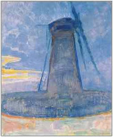
You can paint—or photograph, for that matter—the windmill in Domburg against the evening sky (see these and a few more of his paintings at the website of the Domburg tourist agency). Mondriaan did that in 1909 in a more or less naturalistic style (first picture), although the blue colour of the mill as a suggestion of the late evening light could not have been made ten years earlier in the history of painting. I wonder, by the way, if that blue was a correct representation of how our eyes work: in dark circumstances, the receptors for colour (cone cells) in the retina are almost inactive and we only see light-and-dark (rod cells) —any strong colouring then is fantasy, I'd say. But let's look at how he painted the same mill in 1911: against again a night-blue sky there is a red shape with details in the sky's blue (a window and the axis of the mill's wings). In the tints of blue we see a vague differentiation between sky and earth; similarly, a darker shade of red suggests some volume in the mill. This is not yet an abstract painting, but clearly Mondriaan made a lot of steps in his thoughts in those two years. No longer even an effort at more or less naturalistic colouring: the blue of the sky is way too blue for that and the earth should not be the same hue of blue and just a bit darker. And most of all, of course: the mill has turned red! We have two of his later three primary colours here, with much contrast. It is all about strong shape and strong colour; the viewer must be struck at the very first moment by a strong impression. It is not about being true to what the painter's eye saw. For me, that was the eye-opener about this painting: think of what the viewer will experience!
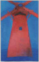
Bonus puzzle for you, dear readers (and to me!): interesting that Mondriaan chose to keep the sky coloured close to nature and to think that the man-made addition to the landscape was the more mutable one, of which he could change the colour. Why did he not do it the other way around: a darkish, bluish or perhaps black mill against a red sky?

Another bonus, as an aside: does Mondriaan's red mill show influence of photography in the strong perspective as if the mill was photographed through a wide-angle lens? Ans dhat about his cutting of the wings, is that not also in imitation of an 'error' of photography? Or am I anachronistically over-interpreting things here? For instance, did they have such strong wide-angle lenses in 1911?

2008-12-22

Improving Reproductions


Did a second batch of old portrait reproductions for my father-in-law. I took more liberties than in the first batch. Let's call it progress of insight, but it was also a matter of realising the uses of technical tricks. The change of insight was that this was not about being as faithful as possible to the old pictures as they lay before me (as I worded it in my 2008-08-07 'Old skool' entry), but to aim for the best effect from the point of view of the beholders—my father-in-law, in this case. He wants these pictures as reminiscences of the ones depicted, or to get a better impression of family members deceased before he could know them. So what he wants is as clear a portrait as possible, a reconstruction of the original photo at least when it comes to the persons' portraits. Why didn't I think of that before? Every professional photographer knows it: people are not interested in the photos per se but in the persons!

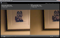
Sometimes the photos were so bad that it was not worthwhile to try to improve them, but there were some cases where Lightroom 2 could spice up the persons' faces. Here's a little 'how to': photo 1 in this blog is a detail cut from the version I would have handed to my father-in-law in the first batch. But I did not like the flare from the backlight flowing over the roofs in between the houses. LR2 gives the option to apply corrections to parts of the photo: you just 'paint over' the area with a brush (in the Develop-module). To see where I am working, I set the brush at '+2 exposure' or something similar—as long as it is visible (see photo 2, from a different one, obviously, than the comparative picture). The brush settings include large size (for working fast) and a high feather (for a flowing, invisible border). Remember: LR makes no changes to your original photo at all, everything can be undone—no need to be nervous about painting a granddad a little white!

Then I set the sliders in the painted-over area to what gives the best effect: in this case especially exposure down a bit; besides I added contrast and sharpness. The result is not dramatically different (my father-in-law must think it is the same old picture), but just a little more recognisable as a portrait. I hope you can see the difference in this small reproduction; I do, in the original of this 1930s family photo.

2008-12-21

Where is Frans Lanting when you need him?

In rushed my wife: "A bird of prey caught a dove!" Oh, where is Frans Lanting (or any other nature photographer) when you need one? Rushed out of the study behind her, camera in one hand, memory card in the other (I had just imported some pics into the PC) and switching the camera to Sports mode at the same time. I usually hate those pre-cooked modes, but now it came in handy: ISO 800, fast-shutter time preference, hi-speed (5 frames/second) drive setting. Not that we saw much of the sparrowhawk, because he (it was a young male) found a spot to devour his prey in a secluded corner of the garden and we did not want to go out and disturb him. So photos had to be made from behind the window. The trees and other growth made manual focusing necessary and that was not easy I must admit. How do the Frans Lantings of this world do that? I admire them increasingly. By the way, I mentioned Frans Lanting because he once published this book 'Eye to Eye' (sold out now, there's just a postcard-book at Amazon and a special portfolio at Taschen), and the eyes are the most catching part of my photo too, I think (the rest is sub-zero quality—don't mention it!).

Blog’s Midlife Crisis? What Crisis?

Was I silent! Sorry, dear readers, I'll be more active in the weeks to come—until work kicks back in in its usual full force, that is. This is not a midlife crisis of the blog, let me assure you. I have read somewhere that the average blog is maintained for nine months. Would most people take this period as symbolic:, I wonder: time enough to conceive a baby and then we go back to the real world? Or is it a sign of people's whimsically shifting of interest in this 21st century world? Anyhow, I'm going on! Crisis? What Crisis?

2008-12-07

Oscar van Alphen (2): The Photo as a Shroud

"The photo shows reality as the shroud shows the dead body
without identification, without name, without history.
What remains is the external intensity of the neutral,
the fascination with the ever-recurring question about concealing or revealing."

Thus reads the first of two stanzas copied into an "Untitled" picture of 1987 by Oscar van Alphen—I promised I'd come back to him. The photo is a black-and-white one, with a large, rolled-up white sheet (the shroud of the poem) in the foreground; the rest is a Dutch, flat landscape. A rather empty picture, accordingly. Which fits the poem alright.

Van Alphen's photo is the only one of over a hundred in the 1991 exhibition catalogue 'The Decisive Image: Dutch photography from the 20th century' with a text in it. (Must have been difficult in those pre-digital days to get a text into a photo with darkroom techniques rather than printing techniques. Probably a slide of white letters on a completely black background copied into the large photo. But that was not the point of my blog entry.)

His text is indeed a question about the truth in photography: what is "in" a picture? What is its relation to reality? How external is what we see in a picture? These are not easy questions—were not easy in the analogous days, and have become more complicated in the digital days in some (but not in all) respects. It is too late in the day for me to even try to approach the question intellectually. Perhaps Van Alphen was not so crazy when he tried to do it with a photo surrounding his text. Roland Barthes' 'Camera lucida' with his musings on the photo of his deceased mother are not a very readable alternative... Strange that death plays a role in Van Alphen's picture as much as in Barthes' classic text on photography. Or has Van Alphen read Barthes'text? For although we see only the 'external intensity' of the photo, it may lead to the thought of where it came from: what was the photographer trying to tell us? Why was s/he trying to tell us precisely this? That is where Van Alphen's reading on photography may come into play.

Even more to muse upon, when the evening gets still later.

2008-12-01

Stairways

Stairways again, and cupolas--fascinating elements of architecture. This was taken in Haarlem, two weeks ago. Just too bad that my mobile phone's camera is so bad. The (too vivid) colours may work nicely here, but that is the only positive thing about this photo, I fear. Must go back with a really good camera + lens--if I ever find the time...

2008-11-29

Oscar van Alphen - Dutch photographer

Photo magazine 'Focus' in its December 2008 issue has an article on photographer Oscar van Alphen--a bit of an advertorial, since they are publishing a book about him. I did not find his documentary photos that remarkable, but was triggered by the remark that he was a pioneer because of his 'asking often fundamental questions about the medium that others found to be essential only much later'. How could I--thinking that I too am interested in the question of what does photography do?--be unaware of him?

After all, he is mentioned in the standard anthology 'Fotografen in Nederland' (not at Amazon, but sold by Proxis) and there I may find the clue why I was not triggered to his work: one of his major books is praised for being an 'associative whole' and that is the type of artistry that puts me off: I want a formal Auseinandersetzung with basic questions, even if I have to admit that photography works more directly through the senses than through formal logic and reasoning. At least you should know why it works the way it works, I'd think. Stil this Van Alphen seems an interesting guy to look into. Some of his photos from Amsterdam (oh, how 1968!) are found at the local council archive, and one of his apparently most famous installations is revived in an exhibition right now in the Rotterdam Fotomuesum.

If I find time [big if!], I'll check his basic questions (he wrote some books about photography) and then I'll come back to him in due course.

2008-11-27

Calibration frustration

To be honest, one reason for concentrating on black-and-white prints (next to the artistic value of which I really am convinced!) was that I found my HP Photosmart Pro to make colour prints too yellowish. Yet at least the family's holiday pictures should come out in colour, right?

The camera club just bought a Colormunki, to ensure calibration of monitors as well as printers. The salesman all but promised us salvation: this was to be the ideal apparatus for the job. And X-Rite quite kindly allows you to register the Colormunki for the whole camera club, for all its computers! But first results are frustrating: far from perfect colour prints yet! Too much green now, if you'd ask me—there is change, but little improvement. And don't blame the HP printer—club-colleague Louis has similar problems with his Canon printer. We'll have to dive deeply into switches, manuals, colour spaces, etc. in the hope to find a solution...

Here's the photo I was testing with: subtle stone hues—the picture works well in black-and-white, in fact! ;-) To add to the frustration, this 2005 picture (taken in Bordeaux, France) I took to a digital demonstration day of the national photographers' association, BNAFV, a month or so later, and the guys demonstrating the Epson R1800[?] got a perfect print right from the memory card!

To be continued, I fear...

2008-11-26

Black-and-white photographers, be free!

A simple trick I finally learned from Lightroom is how in black-and-white photography, we should feel free from the rules. Until recently, when making a black-and-white print, I started from a colour picture that was more or less optimised. Not completely finished for printing in colour, but with colours corrected, the right white balance, etc. With some (pedantic) disdain, I never used Lightroom's presets to convert that picture into black-and-white, but did so by and, fiddling carefully with the greyscale controls that work more or less like the channel mixer in Photoshop: you can control how light or dark eight parts of the spectrum (from red to yellow, to purple and magenta) will be represented. And then I'd adjust the overall contrast to get nice dark, yet sufficiently detailed shadows and good highlights. That was before LR2; since then I'd add some dashing and burning in parts of the picture.

Once I tried the LR presets though and found that they used different effects: no use of the grayscale mix at all, but simple desaturation and ruthless adjustment of exposure and white balance! I won't follow their route completely; I'll keep using the grayscale mix to have better control of how my blues (sky!), reds (skin!) and greens (plants!) are converted into tones of grey, but radically changing the white balance (usually to a low temperature setting, say 4000 K) was an eye-opener that helps to get strong effects that work well in black-and-white. For it is the effect that counts, and we are not accountable for the numbers of the colour temperature to be correct!

The photos are symbolic of 'working'--seemed fitting to today's theme. They were was taken in Hanoi, earlier this month.

Alea iacta… Another competition

Not sure if I'm testing myself or the juries, but I just sent in three photos to a national competition, the BNAFV's first-ever 'Foto Online'. At first I though I would not do it, expecting thousands of photographers to take part. But a few days ago we got a reminder saying that there were 180 participants. Well, then I could give it a go—basically with the same photos that I submitted for the regional contest less than a month ago. I redid the black-and-white one for which I got the comment that is at too grey and 'murky'; tried to strengthen the drama and contrast in the air. I still like the picture of this strange building in Almere, and am curious if I'll get similar comments from this national jury.

The other one from the regional contest that I submitted, was the allium (from our own garden, taken as a test-picture on the first evening that I had my Alpha700), again because I like it and also a little bit because someone in the audience found that it deserved a higher grade.

And you're welcome to comment too, of course!

2008-11-24

Vaut le voyage: Berlin

No picture to stake my claim—sorry for that, folks! But my visit to Berlin this week was only for a meeting. The meeting was long, the stay was short, the weather was bad and the camera was at home. Yet even from the bus between the airport and the city centre it was more than obvious that this is a place for great photography of different types. Modern architecture on a grand scale, to begin with, of course! And many photographers know that, for in the regional competition, there were photos from the Sony office in Berlin by three contestants (one of them was awarded—too much competition for the others). The grey November day was a good backdrop for the buildings with the lights on everywhere, taking you just this step beyond standard architectural photography. Dreary days may make for good photo opportunities! And then of course the people in the streets and their ways to protect themselves from rain and cold, made up another bunch of objects for pictures.

Maybe I'll be more lucky when I go there next—or my camera club should make a trip there. Obviously, many others have done so already, but that still makes one's fingers itch: by pointing my camera a little different, by finding that great light, by releasing the shutter at exactly the right moment... We might shoot that wished-for winner!

2008-11-17

Pioneers of Travel Photography – Vaut le détour

The Teylers Museum in Haarlem has an exhibition of 19th century travel photography, bringing together photos from the national Rijksmuseum (still in a state of mess due to over-long reconstruction works) and its own collection. The collection of tremendous, detailed, purely registering, photos is worth going to Haarlem for if you happen to be in Holland—'vaut le détour' in terms of the Guides Michelin. You have time to make the detour until the turn of the year; the exhibition lasts until 4 January 2009. As I happen to live in that country, I went to see the exhibition.

'Purely registering' I said, thinking back to the comments from Frank Boots. These pictures had no pretension to make an impression as artistic images, but only to show those back home the exotic world beyond one's own town and region. And we should remember that until the mid-20th century for most Europeans town and region made up the ambit of their geographical and cultural knowledge. Alright, the bourgeoisie, the intended audience of these photos, may have travelled a little further: I'm still impressed with the stories from late-19th century novelists who took up residence in Southern France or even Italy for the winter and coming home to northern Europe only when the weather was supportable there, in summer. Or who made their career in the colonies. Those people travelled, spoke their languages (at least French), and had a broad view on cultures and cultural differences. Those differences must have been much larger than now, with our globalised culture: whether they call it MacDo in French or MacDonald's in English, you find the same fast-food counters everywhere, the same fashion shops, etc. Alright, there are some variations in the fast food assortment per country, and size schedules for fashion differ a little depending on the usually wider shoulders and hips in e.g. Germany compared to Southern Europe. But those are details, compared to the wide variety of local food, local dress, etc. of the 19th century.

But even then: to see photos from other continents must have been a stunning experience in itself to the 19th century audience. No need to do anything artistic; these pictures brought Das Andere suddenly close to many people. 'Registering' that was more than enough. Everyone knew about the hardships of the audacious men (and a few women) who made expeditions to wild places—they could read that from the pictures just by seeing the exotic buildings, landscapes, ruins and—a little later—the 'types' of the peoples from those world regions in their typical state of (un)dress. So 'registering', 'documenting' was what they did in tremendous detail. What a richness of grey tones (of all shades from cold to warm/sepia)—no graphic blacks and whites! What a cornucopia of details in every picture—no cropped buildings or portraits for them, but full shots!

Do the photos show European superiority as it was believed in during the 19th century? It was the time of establishment of vast colonial empires by European countries, after all. In a way, the pictures cannot but be a show of European superiority: Europeans took those pictures—they had the technology, they looked through the viewfinders (or how do you call it with those big glass plate cameras?), they released the shutters. And yes, there were some indications of Western supremacy in some photos. Not that there were any hunting scenes, with the white man standing proudly with a foot on the killed tiger, elephant or hippopotamus. But it was revealing enough to see "our camp" as the caption of a photo of tents among the ancient ruins. Or to see the new railway bridge, with a steam train running over it, above the old and decrepit rope bridge deeper in the valley of the Padanger highlands on Java. Yet for the most part, it was not superiority, but astonishment at the diversity, the other-ness that struck me in those pictures. They were an effort, according to me, to show those back home how strangely beautiful the world was.

Forced by the technique, no doubt, but fitting in that idea of showing in as few hard-to-come-by photos as much as possible, they not only show a number of details that we now would divide up across half a dozen of pictures at least, but they also were sharp from front to horizon, a depth-of-field that we almost find overwhelming.

In short: have a look if you can, also at the amazing stereoscopic pictures in the Kaiserpanorama.

By the way: the picture in this entry of Gizeh in the late 19th or early 20th century was googled from the Internet, and I believe it to be not copyrighted.

2008-11-16

Photographers, be free!

When we heard Frank Boots, spokesman of the jury and president of the national association BNAFV, explain his judgements on the photos in the regional contest, two remarks stood out for me.

The first was that amateur photographers are not accountable to anyone. We should feel free to make any photo we like. He did not go into that any further, but he must have meant something like our not being bound to be faithful to nature or facts, since we are not journalists or documentary photographers. Nor are we bound by the canons of art—Mr. Boots made this remark as something coming out of a public discussion he had had with a museum director. That part of his implication was not so clear to me: I thought that if any group were good at breaking canons and being free, it was artists.

His second remark was that there were typical camera club pictures: details of buildings, dilapidated window sills, and similar still-life pictures. Or portrait and model pictures that were neat, pretty-pretty. Mr. Boots wanted more than that, wanted something 'crazy', something personal, something (in the words of last year's jury in the same regional contest) 'authenticity'.

The photo that goes along with this blog, then must be an homage to camera club traditions, but after his remarks I did put it through Lightroom once more to make it something a little more personal. I'll spare you the details, but in the words of Dolly Parton, 'it takes a whole lotta money to look this cheap'—it took me a whole lot of fiddling around to make it look this cheap. By the way, the photo was made last week in Vietnam, just a wall on a street in Bat Trang, a village near Hanoi.

2008-11-15

Gained in Translation – Award Gained and Hall of Fame

Not being a native English speaker, I make my share of errors in using that language. Only recently did I learn, for instance, that my expression ‘photo club’ is not the common one—it should have been ‘camera club’. To soem extent, that would have been the better translation too! For the Photo club I belong to, often is much more of a Camera club: the guys keep talking about new cameras, selling their old gear and buying new, etc. Much less talk is about making photos. Until recently! Last club evening was surprising in that we talked about taking pictures and about how to get the best prints from them. So for the first time it really was a ‘Photo club’ rather than a ‘Camera club’—something was gained in my wrong translation!

And it seems that this attention to photos instead of cameras and other gear paid off! Because even more recently, even more was gained. For the third year in a row our camera club (let’s use the official term) took part in the regional competition for best photos and best club. The first year, 2006, I was on my own as the others who had agreed to send in some photos withdrew at the last moment. Last year, in 2007, we still had one drop-out and instead of the ten pictures, we only sent in eight. Therefore we did not qualify for the club competition. But the good news was that one of the photos was selected for the exhibition of the thirty to forty best of the region; it was Eric’s English landscape with hay stacks. But this year we had a full contribution and although most of our club’s pictures were just average, according to the jury, Louis’s ‘Escalator’ gained the award for best individual picture! It got a ‘gold sticker’, meaning it was judged ‘excellent’.

In terms of competitions, that was the best performance ever of our (dare I say it?) Photo club. The only thing that came close was my gaining a ‘silver sticker’ in a national competition with a colour slide of a landscape in Zion National Park, Utah, USA. That was back in 1992 or 1993, when we all were so much younger. And when digital photography was still much beyond our horizon. And I’m still not happy with the scan I once made of it—nothing beats the translucent quality of good old colour slides!

So here’s our Photo[!] Club’s ‘Hall of Fame’! Funny that in both pictures, patterned lines play a major role.

2008-11-12

Raindrops on a window--a window of opportunity

Filmmaker Abbas Kiarostami published a book with major publisher Gallimard, called Pluie et vent (Rain and wind), filled with photos of one night's rainstorm. The little note about the book in Air France's inflight magazine (Nov. '08) went accompanied by a photo much like one I saw from Mr. E. in my photoclub, of raindrops on a window pane--his was nicer because he had mini-mirrors of the brick pattern of a wall a few metres behind the wet window. And just for fun, I add some drops from this afternoon's rainshower on my home window...

It's just that we amateurs don't think of turning such pictures into a book. Is seeing such a commercial window of opportunity the difference between amateurs and (successful) artists? (Damien Hirst was mentioned on the same page of the inflight magazine--talking of commercial windows of opportunity...)

2008-11-06

Pictures at conferences

Tomorrow I'll be a speaker in a conference, so it will not be my task to take pictures. But if it is your task or wish to do so, clicking here will lead you to some good tips--and nice examples as well of lively portraits and overviews.

2008-11-05

Flooding around Hanoi

Heavy rains led to floodings in Northern Vietnam and Southern China, maybe you heard it in the news. In the Hanoi area, around 50-60 people lost their lives. When I landed at the Hanoi airport, just after the weekend, the rain had stopped (more or less), but along the road between the airport and the city, flooding was only too visible: rice fields were drowned, people were fishing where they ought to be tending the rice.

This is cause for documentary photography! The facts must be made known, esthetics should be second-place considerations.

Still, esthetic questions do turn up: the facts should be put into pictures that are remembered as pictures. One of mine is a clear failure--it is so bad I hardly dare show it, but since it is the only one of the occasion, still I leave the picture here where behind the motorbike two men are lowering a net into the water (the last photo in this entry).
Documentary photography is often black-and-white. Black-and-wite is associated with misery, apparently. I tried, quickly, to see if the following pictures were better in black-and-white, but to my mind the (subdued) colours do not detract from the message.
Since these were all made from the car driving by, I did not hesitate to use cropping to these pictures, and I even burned the sky in the first picture shown, one with the two guys wading through the water to their chest (great tool in Lightroom, this graduated filter!). It may be getting to the limit of keeping truth in documentary photography...


I'm glad I saw nothing worse than this. Wouldn't make a good journalist, would I?

2008-11-01

Noise reduced: firmware update Sony A700

Good to have a photoclub, for I had not been paying attention to the Sony website lately: a new version of the firmware for the A700 was published already in September! Version 4 is meant to tackle my main issue with the A700: noise in high sensitivity settings. Or more completely (from Sony Europe):

* The choice to select auto exposure bracketing (single & continuous) with 3 shots in 2 EV steps has been added. [That is nice for HDR pictures! I'd like to start that discipline once.]
* The choice to turn [Off] the High ISO NR feature has been added. [Great! I want to be in control.]
* Improvement of the image quality in high ISO setting. [This is the main improvement for me]
* Improvement of the auto white balance and D-Range Optimizer performance. [One of my reasons for always shooting RAW is that the auto-white was not always to be trusted. I'll keep shooting RAW, though. I don't use the D-range optimiser; also a matter of wanting to control things myself.]
* Improvement of reliability for communication between camera body and vertical grip. [Don't have that thing.]

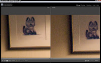
Of course I immediately made a quick try of higher ISO settings. My impression is that ISO 1600 is as good now as ISO 800 was: quite usable. There is a visible reduction in quality from ISO 1600 to 3200. See first set of compared photos. This (out-of-focus) detail from the top-left corner of a picture shows this effect.

The settings of the noise reduction do make a difference. My impression is that setting the noise reduction to 'high' is a big improvement for larger areas, but may make edges and shadows a bit too 'rough'. Look at the left side of the picture frame in the comparison of two photos below.


Thanks to Dieter for telling me about the firmware update!

2008-10-29

How dark grey black-and-white can be!

Last Sunday was the last day of a large photo exhibition in Leeuwarden. I took this final opportunity to go and see it. The exhibition was part of 'Noorderlicht' which had Central and Eastern Europe as its theme this year. The exhibition 'Behind Walls' was indeed large, with hundreds of photos made during the years of communism. Additionally, another exhibition in the same 'Friese museum', called 'Beyond Walls', showed work from after the fall of the Wall. Of course there were great prints to be seen, but I must admit that the overwhelming feeling with which I came away was a dark grey feeling of oppression, loneliness and hopelessness. It is as if black-and-white photography is only used to document sad situations.

Even the prictures from recent years in 'Beyond Walls' were largely in black and white and were largely about the leftovers from the old regime, rahter than giving an impression of new times starting, now possibilties and a bit of joy in the world. While in my travels to that part of Europe (I have worked on projects with colleagues in Central and Eastern Europe since 1991) I found the situation more balanced. True, the transition was a hard time, but people were happy that they were free to speak their minds, to start new things and generally to 'come back to Europe'. True, too, that the transition left everyone less secure than before, and some groups were sadly left behind (the glue-sniffing boys in Romania I have met myself, not just seen in the pictures this Sunday). But I had hoped for a little less gloom, a lighter shade of grey.

2008-10-25

Test, relevance and reputation

The November 2008 issue of Black & White Photography has a column in which Mike Johnston defends his way of testing cameras and lenses. He argues against trying to be completely objective: it is not the figures that matter, but the trial of the gear in dfficult, actual photography circumstances. I completely agree with Mike: too often testers focus on what is measurable rather than on what is relevant--not just in photography but also in my professional field of higher education. There, rankings are made of things that can be measured but whose relation to educational quality are uncertain. Similarly for photo gear: their 'performance' in laboratory circumstances is only a remote indication of what you can do with the thing in practice. In practice, all kinds of circumstances and especially your own needs are much more important than the 'objective' figures. You use different focal lengths, differnt distances, and handheld instead of on a tripod as they did in the test, or you take different types of pictures. For instance, my new standard zooom lens got fairly good test results, but with my preference for architectural pictures, the slight distortion in the wide-angle setting weighed more heavily than what I could read in the mags. Or take the high-quality lens I looked at: it was indeed great from a technical point of view, but way too heavy to be practical on a day-long hike. So let me quote Mike's conclusion: 'The bottom line is that observation is at least as important a method of inquiry as measurement is. It is no less relevant and no less reputable.'

2008-10-23

Lightroom update: version 2.1

Adobe have published an update for Lightroom. The latest version is 2.1. They've added support for a number of recent cameras (such as the Sony A900) and fixed some bugs that I had not run into yet (so much the better).

Of course I immediately donwloaded it when LR 2.0 gave a pop-up telling about the update. All I can say until now is that 2.1 functions--and that is good news, I suppose!

2008-10-20

Fotobond's "DigiDag"

The national association of amateur photographers, the Fotobond or BNAFV, organised a national Digital Day in Apeldoorn, sporting a studio for model photography, a lecture by a pro photographer (Kees Tabak, which I did not go to, though his website promises very good portraits), and some semi-commercial entries from major photography/camera shop Calumet. They had a few shop things (but I don't need anything new at the moment) and gave some 'teasers' for their workshops in Lightroom and Photoshop. As an enthusiastic Lightroom user, it was good to learn some more tricks with the package--and even better was it to see Wout de Jong's enthusiasm for Lightroom as a pro photographer, too. He said repeatedly that LR saved him about a day's work a week, and the tricks that were new to me mostly were of the time-saving type. First, there were more keyboard shortcuts than I knew of (much faster than all those mouse clicks). Second and even more importantly, he used the sync function to great effect, to in fact copy the whole list of adjustments (if you chose all of them) from one photo to a host of others. Being a simple amateur, I don't often have series of photos, so I won't use this often, but it is a thing to keep in mind!

My Fotoclub pal, Mr. L., and me were surprised that there were not more than around 50 or 60 participants in this national DigiDag--we had half as many on our Club's digital day last Christmas, from just 30 kilometers around us!

2008-10-19

Autumn blues

Last weekend I walked the last stretch of the "Overijssels Havezatenpad", the long-distance walking path that made me discover a lot of landscapes near my own home over the last year and a half that I hardly knew. From the "Weerribben" I came back on the "high" land around Steenwijk. The Weerribben were boring and there even were hardly any geese or other birds to enliven the area; I definitely liked the area around Steenwijk much better, because... it looked like Twente. And I was not even born in Twente! Still I prefer the fields with trees around them and the (very) low hills to the flat wetlands. The cows were a nice welcome, as well.

On the other hand, this being the last part of the walk put me in a 'goodbye' mood, strengthened by the beginning autumn. The picture with the completely dried-out corn waiting to be harvested and the skeleton of a small windmill symbolised that autumn feeling. If you'd print it a little darker and with more saturation than the original colours, it might look like a 21st century version of Van Gogh's last painting, the one with the crows. and that association made it even more of a goodbye!

2008-10-06

A little late -- Building and handball

Dear folks, sorry for not updating this blog last weekend: work, work, work! The work took place in the Copenhagen Business School, by all accounts one of Europe's top business schools--but that was not my reason for being there and even less was it my reason for mentioning it here. I mention it here, because it offers great opportunities for photography of architecture. Next time when I go there, I'll bring camera (and tripod!). For the moment, I just have an illustration taken from someone else.

Photo activities last week were there, but rather to make a visual memory of my daughter's school activities than as serious search for the ultimate photo. I must admit that for most people, the memories are more important than the photographic quality.
The school activity was a handball tournament among some of the village schools. Sports photography proves to be quite a different discipline: suddenly you miss the 2.8/300 or similar lenses of professionals. The one here was made without flash (not used, because it might disturb the players) at ISO 800, and is better at showing the speed and action (hey, I succeeded in panning precisely with the player's body!) than at portraying the star player of the team: the picture shows his back rather than the front side--why wasn't he a left-hander? ;-)

2008-09-29

Essence of Holland

Days are getting shorter, up in the Northern hemisphere, and that also means I have little time left for blogging or for working on the pictures of today, after my walking tour of the day--35 kilometer in the area of Wieden and Weerribben, starting in the autumn mist. Kind of chilly to start your walk, but great for atmosphere in the photos. My favourite (at least when I made it) is this one of an old boat in an old canal (Arembergergracht, dug out in the 16th century, in the neighbourhood of Giethoorn, which is famous for its little canals). Parallel planes to suggest depth, the mist adds to the atmospheric perspective, and hardly any colour apart from the grass in the foreground. Essence of Holland!

2008-09-24

Anti-Zoo?

Last weekend, we visited the 'Noorder' Zoo in Emmen, but the only photo that I found interesting was not of exotic beasts. The hippos, elephants, leopards and what not are simply too exotic to make an interesitng picture. It is as if you are seeking the effect of stupefying your audience if you show these pictures. To make a picture convincing, you have to downplay the "surprise" effect of the zoo animals and do something surprising with a "normal" subject: an anti-zoo picture, as it were. My candidate is shown here: an ordinary grey heron--a bird that is getting all too common in the Netherlands--but if you ask me, crisply sharp with good colours against the blue (patch of) sky and in an unusual perspective.

2008-09-22

Zen and photography

If you try the key words of this post's title in a search machine, chances are you stumble upon a website that is pretty good at showing photos fitting to this theme. Too bad that it has not been updated for a year: www.zenandphotography.com. Whatever the reason for the photographer's stopping, there are some nice pictures for our enjoyment.

2008-09-20

Hardware again: what you see is...what you criticize

In this blog I wanted to focus on photos and their content. Still, every now and again I threw in some remarks on hardware (my camera's and lenses' limitations) and software (my use of LR2, for instance). So this time I cannot refrain from remarking on the use of a good monitor. I had the pleasure this week of trying out an Eizo monitor--not a super-professional one, but a 'mid-range' CE-series wide screen of 21" (Eizo CE210W). Something a serious amateur might still afford. And was it an eye opener! It promises to show sRGB, not the biggest colour space, but at least they say what the monitor can do--you don't find that on the "normal" brand monitors.

And the combination of good colour representation and a fairly good size (21" as I said, 1600x1000 pixels (rounded down)) gives you a very crisp and detailed view of your photos. They never looked as bad as this--gee, does one get critical of sharpness, colours, and all other technicalities! So again, I am not writing about photo content, but a good monitor shows how many conditions have to be fulfilled before you can start thinking about a good photo. It gets ever more difficult--but I'll keep going! Stay tuned, once we'll get there. I hope...

Now this focus on sharpness, colour space and what not may be a typical photo-club amateur view: do you have to be technically perfect to make a photo that is saying something to your viewers? Does technical perfection not stand in the way of creativity, intuition, use of the 'decisive moment'? Is it not a problem of photo-club pictures that they are always striving for technical perfection only, forgetting about the artistic communication?

I suppose that there is a bit of a tension there, and that many amateurs (including me) should try to focus more on the content than on the form/technicalities. There is another side to it, of course: creativity is not a license to ignore technical high standards (I don't want to say 'perfection'). And that can be trained; technical correctness must become like second nature, something you do without taking your thoughts from trying tomake a meaningful photo. In turn, that means photography has to be trained like any craft or skill: do it often. Repeat, repeat and repeat till you know what your camera and other equipment without do even looking at it. 'A thousand repetitions and suddenly perfection emerges from one's true self' How comes I end with a zen-saying again?

2008-09-18

Work and pleasure

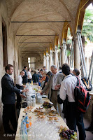
Last week I was out of the country, presenting my (and my colleagues') work at two conferences. Not a minute for serious photography, only the joy of having morning coffee in a medieval Italian monastery, now the Faculty of Economics of the University of Pavia--in dire need of restauration (it's Italy, after all), but still: that is the original environment for European universities!


The joy of photogaphy came with the occasion to experiment with the A700's highest sensitivity settings: ISO 6400 and 3200, respectively (reduced jpegs of the otherwise unchanged RAW photo's). Especially ISO 6400 is close to useless; ISO 3200 is not bad for the purpose of documenting a late-evening tour of a vinyard.


And then there was the visit to the Certosa di Pavia. "ABC" in kids' jargon: Another Beautiful Church. Very beautiful, but not a place for very interesting photos. What can you add to all the beauty of the craftsmen of the 14th-16th centuries? I was reasonably satisfied with only two photos, and that for technical reasons mostly: I more or less mastered some challenges--next time I want to make some real nice pictures with that technical knowledge...

In the first, I wanted to make the craftsmen's beauty visible in a picture of a detail of a pillar plus the painted vault. To show both, I used the built-in flash of the camera with slow sync (otherwise the vault would have remained dark). The amount of light in the background satisfied me quite a lot. Of course, as a tourist on a conference, I did not come with a tripod, so the result is not quite sharp, but for a 0.7" picture it's not bad. And Lightroom 2 (great new options in this version--a must-have!) helped to sharpen it a little.
The other one, the church's facade, needed Photoshop to readjust the falling lines of the 16-mm perspective: I wanted to capture a lot of clouds above the church so in the fleeting moment when the light was right, I just had to shoot a bit upwards. When that was done, Lightroom 2 was used to make up for my lack of a gradual neutral-density filter; one of Lr2's new options is the 'graduated filter' and that helped to bring the picture back to the impression that the situation had made in reality.

2008-09-07

Composition with balls?

Sometimes, I don't quite know what to do with a photo. Take this one. I was attracted by the bunch of balls lying on the training field--the sportsmen and -women were probably gone for a break, or the trainer was preparing for the next bunch of kids coming. It was a funny picure, I thought, with the uniform green (artificial 'grass'), straight lines and the random composition of balls. But due to practical limitations (I had to take my pictures from the outside of the terrain, from the sidewalk in the street), I could not get a shot without the messy surroundings of the border of the field, stuff lying around, etc. And now I'm stuck for good ideas: how to maintain the feel of the area, and yet make it better than this messy snapshot? Cropping does not work well, I think, and that is the only trick I can think of. But I want to keep that one ball in the background, which gives some feeling of depth, or continuity that helps to make it authentic rather than a purpose-made composition. Wish I could go back, but the summer season is over around here, and anyway another time the trainer will not have had the same luck with his random throwing around of the balls.
If I succeed in making a better picture out of it, I'll let you know! Just remind me if I forget...

2008-09-06

Just pulling some strings: what cropping can do


I was just toying around with a photo from last weekend's basket makers. One had some handmade rope lying on the table, and I found the forms of it irresistible: the mix of order (nicely wound up, tied together, and the rope itself, made of twisted fibres) and irregularity (visibly hand-made) did it, I guess. And then the question is: what is a good format for showing that? The square one, with two bundles that seem to go away from one another as your eye moves from left to right (as Europeans tend to do), or more simply, focusing even more by 'pulling the strings' of the cropping tool so that you see only one bundel of it. Should I have cropped even more and take away all of the burgundy background? Naaah, I feel like having a glass of red wine anyway ;-)

2008-09-03

A shot returned: Reaction from Kyuodokas

A very kind and enthusiastic reaction came from Jeanet Pot, the Sempai of the kyudo group that I photographed in Noordwolde. They were happy with the photos that I had sent them; they did not often get good pictures showing the concentration of the archers.

Looking at the Dutch kyudo association's website, I can understand her enthusiasm a little. The professional-looking picture at the home page apart, the pictures made to document different events were, well, amateurish. Alright--to everyone their own hobby and their own effort at excellence.

2008-09-01

Zen among the willows

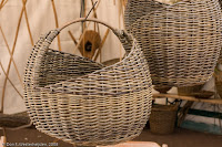
Saturday we visited the 'Vlechtdagen', the fair for basketmakers in Noordwolde, in the North of the Netherlands, where they have a museum devoted to this old craft. My wife loves to put her energy into folding, weaving and sometimes even beating the twigs into shape. My interest would be more in the surroundings, to see if some more abstract or architectural theme would offer itself. And it did! But there was more for my photography than expected.

The fair's theme this year was 'Japan', with a show of marvellous Japanese basketry--even interesting to people like me who are not into making willow baskets. Photography inside was not allowed, so I can show you only one little picture ;-) of a creation called Connection, made by one Takeo Tanabe. The original plan had been to invite the artists (rather than just artisans) from Japan to demonstrate their skill, but apparently the organisers' funds were not quite sufficient to make that possible. Too bad! I would have loved to see these people at work: would they be able to concentrate on the precise detail in the hum of a fair? Would they work fast as in a routine, or slowly as monks?
We had to make do with mainly Dutch and German basketmakers; an example from my wife's favourites at 'De Mythe' is shown here.

But we were also given the chance of some other Japanese arts and besides the ubiquitous bonsai tree pruning, they had something rather more special. Didn't I write about kyudo, the martial art of archery, before? A Dutch group gave a beautiful demonstration of what I might translate as the essence of photography: prepare your materials, yourself, and then wait for the right moment to let go. A lesson in Zen-plicity, which I involuntarily started to mimick with my camera while watching them go through their ceremony. With one little difference: they had one arrow, and I had 5 frames per second... Hopefully, they'll forgive this novice for cheating on the rules a little ;-)


2008-08-24

Put me on the map

I've been fiddling around a bit with putting some landscape pictures on the map--the world map of Panoramio, that is. Fun to see where I've been, how others saw the same environment, and realising that other people watch your pictures with--I guess--a similar interest. It took me some time to find out how it works, especially with the labels: first create a label, then click the option 'Apply' and only then click on the picture(s) to which it applies; I kept wanting to clik pictures before saying 'apply'.
What I also find cool is to see the EXIF-details of others' pictures: once you click on a picture in Google Maps or Panoramio, it pops up and if you click on it a couple times more, you get to a page with details of maker & location, and also there is a thingy with "further detailis". If you click on that, you get to see the make of the camera, shutter speed, aperture, focal length, ISO setting and use of flash. Can be interesting to learn how they did it.
The downside of putting pictures on the Google maps used to be, I thought, that you have to wait for ages for pictures to get selected for Google Earth (which is true). But through the Panoramio community and/or Google Maps, you get 'hits' quite a bit faster than that. And isn't instant gratification an important stimulus to keep going? OK, now that I seen that my photos are seen a handful of times already within a week, I'll keep going and upload a few more pictures from more exotic locations than Twente or Ameland.
But before I do that: I really want to get the copyright notice into my pictures again. So after my recent laptop crash I'll have to download that bit of shareware software, Bildschuetz Pro (also available in english) again for doing that, without having to go all the way to Photoshop. It's easy to use, once you have found the c-with-a-circle in your word processor; MS-Word's aoutocorrect function does it automatically if you type in "(c)" and undoubtedly Open Office has a similar trick, but then again, so does the software itself, if you don't destroy the automatic settings: use "%(c)%".
A disadvantage of putting in a copyright notice in a JPG-photo is that with every time you save a JPG, it is compressed anew and that diminishes the quality somewhat. For 'serious' photos I would find that a real drawback, but for web pictures it is not a problem--if anyone is interested in getting a high-quality print or copy, they can always contact me. Yes, this is an invitation ;-)
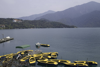
By way of example: Below is Taiwan's Sun-Moon Lake, clearly one to put on the map!

2008-08-17

Hard words on hardware

Let's admit it: sometimes my choices are not as successful as I'd wish. I told you why I compromised on quality of the standard zoom lens. Yesterday I had my first real 'expedition' with the Sony 3.5-5.6/16-105 and I was not happy with the amount of barrel distortion in the 16mm setting. I mean, this was not distortion that was measurable in the lab, but it was really visible in my normal pictures.

And while I am in a confessionary mood: the Sony Alpha 700 has some drawbacks too: I find that 800 ISO and above sensitivy settings simply give too much nois eto be useful.

2008-08-09

Quality or Compromise?

When I bought my new camera, a few months ago, I had the firm plan to go for quality. No compromises! So I ordered a standard zoom lens with the camera that would give maximum quality. All of the web said so (for one example: click here). The shop where I had bought the body did not have the lens immediately. 'Next week', they said, and later it was 'In two week's time'. In this way, more than two months have now passed and still they did not have it. 'In a month from now', they promised today after another phone call. I had enough of them and decided to try another shop; all over the net you could find this lens, and quite a few shops said they had it available--not quite for the price of my first shop, but they had it. Well, they said they had it. I called a shop or two, but discovered that the web sites had been too optimistic and in fact they had run out of stock. The third shop did not answer the phone. But that one was not too far from my home, so after dinner I just drove there, à la bonne foi. Lo and behold! Konijnenberg had four of them on their shelves: bigh & beautiful Carl Zeiss 2.8/24-70 lenses! And would I like to try? No, I did not want to try, I wanted to run home with this rare beauty at once. Still, I did give it a try in the shop.
Two quick examples, made inside the shop give some impression of its quality. The first is in the wide-angle setting (24 mm), the second in tele (70 mm). For your inspection they are uploaded full-size (though in jpeg). Of course these are not real test pictures, but still: there is not even a hint of barrel or cushion type distortions in the lines near the margins of the picture. There is no chromatic aberration around the lamps on the ceiling and above the counter, in the corners of the picture. In short: all the high expectations from the rave reviews were made true.
But what the reviews had not told, was that this uncompromising beauty also did not make compromises on size--and especially not on weight! Of course when you look up the specs you can see that weighs nearly 1 kg. But you only realise what that means once you hold it in your hands. This baby completely undid all the good of my camera body's built-in stabiliser! I could not hold it still for a long time. And I imagined how it would feel on a day-long hike with a backpack on my back and the camera hanging in front. Or what an outing with the family would be like: 'Don't say a word to daddy, he's busy carrying his lens!' It took a couple of minutes to say goodbye to a dream of quality, but I clearly felt--literally!--that I must make a compromise here. So I went home with a mid-class Sony lens instead of the Carl Zeiss one. Not a bad one, but visibly in a different class. See the third example--I still was not able to hold my camera horizontal, apparently... Yet I'll be in a much better mood to take pictures, so if the technical quality of the photos may be a little less, my (and my family's!) quality of life is optimised by this decision.

2008-08-08

Old skool

Pictures are not always about expressing beauty, not even those of an amateur like me. This evening and some evenings before I have been busy copying old pictures for my father in law. Then the rule is to be as faithful as possible to the original picture. Still I have been photoshopping a bit, because of course you discover afterwards that you forgot to avoid some reflections of light. Or that the camera on its tripod was not exactly in the same plane as the picture, or the old photo album was not lying quite flat... Some transformation/distortion was then necessary to make the pictures into rectangles again. Moreover, I did not really hesitate to reduce most of the RGB-photos to greyscales, both for the economy of space and to camouflage discoloured spots due to old age. Another change was increasing contrast in greyish pictures, or even in the lovely sepia one that I copy here. I find sepia as an effect almost always out of place, but here it is just a copy of the 19th century original, and then it fits with the character of the picture. By the way, this lady is my daughter's great-great-grandmother (don't I forget one 'great-' more?), sitting for her portrait in her smart dress including the Frisian cap. Year of original picture: I'll try to find out for you...

2008-08-03

2D 2nd time: flat pictures

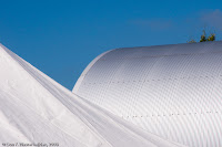
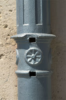
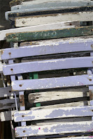
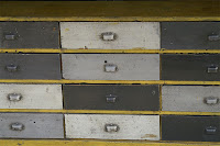
A few more examples of Cézanne's lesson that paintings (and photos) are flat. The lesson does not only apply to landscapes (also think of Martin Kers's remark that landscape pictures should not include the horizon if you don't really need it) or cityscapes, but also to architectural details, or all kinds of objects.
(Of course there is much more that can be learned from Cézanne, but one thing at a time, please!)


Using this trick makes for photos with a different theme than most standard pictures: they direct attention away from the landscape, building or object itself and towards structures, patterns, repetition, rhythm. They become less of a representation and more of a 2D-plane which should please the viewer with its colours, lines, etc. And I like if it also sets a bit of a riddle to he viewer: What do I see? On the one hand, I like it to see such riddle solved. On the other hand, it does not really matter what is being represented. The only photographic question is how it--whatever 'it' is--is brougth into the picture. Somehow, in such pictures I often have a preference for verticals and horizontals--from Cézanne to Mondriaan. But he'll have to wait to another time.

(And sorry if the three pictures do not nicely line up at the left margin as I wanted them; I'll have to learn a bit more about lay-out tricks in blogging...)