2008-08-24

Put me on the map

I've been fiddling around a bit with putting some landscape pictures on the map--the world map of Panoramio, that is. Fun to see where I've been, how others saw the same environment, and realising that other people watch your pictures with--I guess--a similar interest. It took me some time to find out how it works, especially with the labels: first create a label, then click the option 'Apply' and only then click on the picture(s) to which it applies; I kept wanting to clik pictures before saying 'apply'.
What I also find cool is to see the EXIF-details of others' pictures: once you click on a picture in Google Maps or Panoramio, it pops up and if you click on it a couple times more, you get to a page with details of maker & location, and also there is a thingy with "further detailis". If you click on that, you get to see the make of the camera, shutter speed, aperture, focal length, ISO setting and use of flash. Can be interesting to learn how they did it.
The downside of putting pictures on the Google maps used to be, I thought, that you have to wait for ages for pictures to get selected for Google Earth (which is true). But through the Panoramio community and/or Google Maps, you get 'hits' quite a bit faster than that. And isn't instant gratification an important stimulus to keep going? OK, now that I seen that my photos are seen a handful of times already within a week, I'll keep going and upload a few more pictures from more exotic locations than Twente or Ameland.
But before I do that: I really want to get the copyright notice into my pictures again. So after my recent laptop crash I'll have to download that bit of shareware software, Bildschuetz Pro (also available in english) again for doing that, without having to go all the way to Photoshop. It's easy to use, once you have found the c-with-a-circle in your word processor; MS-Word's aoutocorrect function does it automatically if you type in "(c)" and undoubtedly Open Office has a similar trick, but then again, so does the software itself, if you don't destroy the automatic settings: use "%(c)%".
A disadvantage of putting in a copyright notice in a JPG-photo is that with every time you save a JPG, it is compressed anew and that diminishes the quality somewhat. For 'serious' photos I would find that a real drawback, but for web pictures it is not a problem--if anyone is interested in getting a high-quality print or copy, they can always contact me. Yes, this is an invitation ;-)
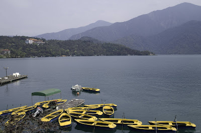
By way of example: Below is Taiwan's Sun-Moon Lake, clearly one to put on the map!
2008-08-17

Hard words on hardware

Let's admit it: sometimes my choices are not as successful as I'd wish. I told you why I compromised on quality of the standard zoom lens. Yesterday I had my first real 'expedition' with the Sony 3.5-5.6/16-105 and I was not happy with the amount of barrel distortion in the 16mm setting. I mean, this was not distortion that was measurable in the lab, but it was really visible in my normal pictures.

And while I am in a confessionary mood: the Sony Alpha 700 has some drawbacks too: I find that 800 ISO and above sensitivy settings simply give too much nois eto be useful.

2008-08-09

Quality or Compromise?

When I bought my new camera, a few months ago, I had the firm plan to go for quality. No compromises! So I ordered a standard zoom lens with the camera that would give maximum quality. All of the web said so (for one example: click here). The shop where I had bought the body did not have the lens immediately. 'Next week', they said, and later it was 'In two week's time'. In this way, more than two months have now passed and still they did not have it. 'In a month from now', they promised today after another phone call. I had enough of them and decided to try another shop; all over the net you could find this lens, and quite a few shops said they had it available--not quite for the price of my first shop, but they had it. Well, they said they had it. I called a shop or two, but discovered that the web sites had been too optimistic and in fact they had run out of stock. The third shop did not answer the phone. But that one was not too far from my home, so after dinner I just drove there, à la bonne foi. Lo and behold! Konijnenberg had four of them on their shelves: bigh & beautiful Carl Zeiss 2.8/24-70 lenses! And would I like to try? No, I did not want to try, I wanted to run home with this rare beauty at once. Still, I did give it a try in the shop.
Two quick examples, made inside the shop give some impression of its quality. The first is in the wide-angle setting (24 mm), the second in tele (70 mm). For your inspection they are uploaded full-size (though in jpeg). Of course these are not real test pictures, but still: there is not even a hint of barrel or cushion type distortions in the lines near the margins of the picture. There is no chromatic aberration around the lamps on the ceiling and above the counter, in the corners of the picture. In short: all the high expectations from the rave reviews were made true.
But what the reviews had not told, was that this uncompromising beauty also did not make compromises on size--and especially not on weight! Of course when you look up the specs you can see that weighs nearly 1 kg. But you only realise what that means once you hold it in your hands. This baby completely undid all the good of my camera body's built-in stabiliser! I could not hold it still for a long time. And I imagined how it would feel on a day-long hike with a backpack on my back and the camera hanging in front. Or what an outing with the family would be like: 'Don't say a word to daddy, he's busy carrying his lens!' It took a couple of minutes to say goodbye to a dream of quality, but I clearly felt--literally!--that I must make a compromise here. So I went home with a mid-class Sony lens instead of the Carl Zeiss one. Not a bad one, but visibly in a different class. See the third example--I still was not able to hold my camera horizontal, apparently... Yet I'll be in a much better mood to take pictures, so if the technical quality of the photos may be a little less, my (and my family's!) quality of life is optimised by this decision.

2008-08-08

Old skool

Pictures are not always about expressing beauty, not even those of an amateur like me. This evening and some evenings before I have been busy copying old pictures for my father in law. Then the rule is to be as faithful as possible to the original picture. Still I have been photoshopping a bit, because of course you discover afterwards that you forgot to avoid some reflections of light. Or that the camera on its tripod was not exactly in the same plane as the picture, or the old photo album was not lying quite flat... Some transformation/distortion was then necessary to make the pictures into rectangles again. Moreover, I did not really hesitate to reduce most of the RGB-photos to greyscales, both for the economy of space and to camouflage discoloured spots due to old age. Another change was increasing contrast in greyish pictures, or even in the lovely sepia one that I copy here. I find sepia as an effect almost always out of place, but here it is just a copy of the 19th century original, and then it fits with the character of the picture. By the way, this lady is my daughter's great-great-grandmother (don't I forget one 'great-' more?), sitting for her portrait in her smart dress including the Frisian cap. Year of original picture: I'll try to find out for you...

2008-08-03

2D 2nd time: flat pictures

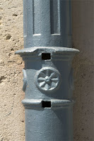
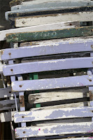
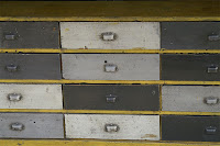
A few more examples of Cézanne's lesson that paintings (and photos) are flat. The lesson does not only apply to landscapes (also think of Martin Kers's remark that landscape pictures should not include the horizon if you don't really need it) or cityscapes, but also to architectural details, or all kinds of objects.
(Of course there is much more that can be learned from Cézanne, but one thing at a time, please!)


Using this trick makes for photos with a different theme than most standard pictures: they direct attention away from the landscape, building or object itself and towards structures, patterns, repetition, rhythm. They become less of a representation and more of a 2D-plane which should please the viewer with its colours, lines, etc. And I like if it also sets a bit of a riddle to he viewer: What do I see? On the one hand, I like it to see such riddle solved. On the other hand, it does not really matter what is being represented. The only photographic question is how it--whatever 'it' is--is brougth into the picture. Somehow, in such pictures I often have a preference for verticals and horizontals--from Cézanne to Mondriaan. But he'll have to wait to another time.

(And sorry if the three pictures do not nicely line up at the left margin as I wanted them; I'll have to learn a bit more about lay-out tricks in blogging...)

2008-08-02

2D pictures in a 3D world


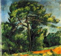
A picture is a two-dimensional rendering of the three-dimensional world that we see. The painter credited with being the first to focus on that reduction of the world to a flat canvas was Paul Cézanne. I very much like his landscapes, where he expresses that realisation quite well. For instance the one to the right: 'This is not a tree, but these are strokes of paint on a canvas, giving the viewer an impression of a tree', he seems to say. From him I learned that perspective in a picture is an illusion and I started to forego perspective quite often.

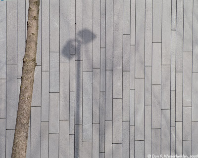
My current PC-desktop wallpaper is an example of that. A picture from the 'expedition' to Almere some months ago: no depth thanks to the stone wall filling the whole background. On the other hand, the tree stem and the shadow on the stone wall give some illusion of depth. And of course (a little 'sinplicity' again): the shadow does not match the tree. At first sight you should think it is, then come to realise that the two don't match. The shadow is of a lantern, and the light does not come from the left but from the right.