2008-06-30

Whatever happened to ... Martin Kers? And the story of two fallen slides

Didn't write a thing for two weeks and now two in an hour!

Writing about Gerco de Ruijter made me think of the famous landscape photographer of a decade (or two) ago, Martin Kers. What is he up to, nowadays? His website is there, but does not seem to have much that is new. Or am I wrong? If you know, please leave a comment! For I liked some of his photos a lot.

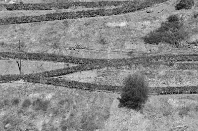
I once saw him in real life, when he gave a presentation with slides for a photo club in Hengelo--obviously, this was before digital photography. The lesson I remember from that presentation was: if you don't need a horizon, don't take it. Zoom in to what is essential in your landscape picture. That's a lesson I took to heart. In fact I already did that sometimes before I heard him say so, but not so consciously. The photo here is one of a later time (a hillside in Portugal, 1995), when I was conscious of leaving out the horizon.
After his presentation, Kers invited amateur photographers in the audience to give him some landscape slides to comment upon. He got a lot of them, commented on them even though they were mostly not landscapes and quite often of a quality that made me feel embarrassed. And of course there were a number of cases when the slides were projected upside down, so they had to be taken out,inserted again in the right way, etc., etc. Mr. Kers was getting annoyed and had had his fill of this amateurish stuff. I could easily notice that, as I was standing at the ack of the hall, only a few metres from the projector and Mr. Kers.
I had brought only two photos, real landscapes, and really good ones, from a trip to the Southwest of the USA, and I felt pretty sure that he would like them. (I really should scan those old slides! I need a vacation, no a sabattical, or the jackpot of the lottery!)
But then fate struck: the last magazine of slides, with only my two slides in it, fell to the ground and that did it for Mr. Kers. He did not want to pick them up, try to dfind out what was right-side up, and then comment on two more most probably (in his thought) mediocre slides. I was not close enough (nor brave enough) to try to convince him otherwise. So I'll never know if those two slides were really as good as I thought.

2008-06-29

Landscape is hot


It's summer (in our Northern hemisphere), but that is not what makes the landscape hot--or: it's not the only thing that makes the landscape hot. There also is a lot of interest in the landscape, including the landscape in the Netherlands. At least that is what my newspaper says. Journalist and historian Jan Blokker is my source, and his sources are several books as well as the theme of the First International Triennial in Apeldoorn: 'Nature as artifice'. For the Dutch landscape, although enjoyed and heralded as 'nature' is largely 'artifice'--and changing at that! Rightly, Blokker writes that the Dutch landscape keeps changing. What our grandparents saw, was very different from what our famous 17th century painters saw, and we we see is vastly different again. In his article (alas not [yet?] online in the NRC Handelsblad site), two pictures are reproduced from re-issues books by Cas Oorthuys--more like our fathers' generation--and mention is made of Gerco de Ruyter--a current photographer. Now that is landscape as I like it! In one of the books Blokker reviewed, De Ruijter is characterized as someone who 'most loves pictures that seem abstract but that are composed of recognisable elements on second view' [my translation]. Have a look at his website to see what that means! He is the guy who invented the camera-kite and to take random(?) landscape pictures.

That made me remember one of the pictures from my balloon trip this May--not made random but very much on purpose and very much with the abstraction idea in mind. Dutch landscape, especially when shaped by humans, is a Mondriaan painting (Blokker referred to the famous painter, too) and all you need to do to make it a modern version of Mondriaan is ensure that the lines are not vertical/horizontal but have a bit of a diagonal slant. Mondriaan would not like it for it is not 'pure' enough, but I think that my picture here does capture the Dutch landscape, Mondriaan's spirit, and Gerco de Ruyter's as well. Wish he saw it!

At the same time, it is also a picture of the changing landscape in our time: the plastic on the field to protect the young crop is something our parents and grandparents would not have seen. And what about our children and grandchildren? Moreover, there is change at a smaller scale: some of the fields are still bare but the top-left bit has some beginning growth in green. That was spring arriving.


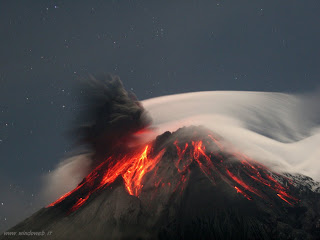
By the way, the book supplement of the NRC Handelsblad containing Blokker's reviews opened with a tremendous picture of a volcano--impossible to take a photo like that in Holland. With a little searching I found the source of the photo and the name of the volcano, the Tungurahua in Ecuador. the photo seems to be in the public domain, so I don't hesitate to copy it. The contrast of the lava on fire, the cold starry night, the white cloud and the black fume! Nothing abstract about it, no strange perspective, but pure nature that needs no artifice.

2008-06-14

Munching magazines

Lately, I have been looking at different photographic magazines, next to my ‘standard’ (but still highly-valued) Focus. I was looking for a magazine with less stress on the technicalities of hardware and camera testing—I knew what my next camera would be. And one buys a new camera or lens only once in so many years. My wife—and even more importantly my savings account—would not let me more often... In the meantime, what do I care about tests of camera brands I’d never buy? And video! On the contrary, I wanted to know more about how to use my photo gear to greatest effect. How to get the best photos on the wall.

First you need good pictures, and I wanted more guidance on that from magazines. I guess that Outdoor Photograhy, with its double aim of wildlife and landscape photography, will be one of my favourite magazines; I mentioned it before. Many pictures, tips & tricks on composition, lighting, etc. The pictures showed the British publisher, of course: there was an item on ‘the quintessential British landscape’ (field flowers making the foreground way too colourful to suit my taste, but indeed very recognisably British), and it carried stories about pictures made in (between) wind and rain. Never before did I realise how many landscape pictures had moving trees in them—long shutter speeds were quite common (make sure you have a sturdy tripod in your survival pack!). During my trip today, at one of the stations where I had to change trains I found a somewhat similar German magazine, Naturfotografie (oh, the costs of writing a blog that is read by only two people!). I have not read all of it yet, but was struck by the editorial, which asked the eternal question about the reality of photos and especially how much pre- or post-processing is ‘allowed’ in nature and animal photography. The obvious answer was ‘it depends’: in documentary photography none is permissible, while if it is just about the esthetical effect, it is hard t set any limit (apart from normal decency, of course). In another magazine, Digital Pro Photo, I learned that serious photo editors of National Geographic Magazine and the like demand the original memory cards from the photographers, or at least all[!] ‘raw’ picture files, to be certain that the chosen photos are not hoaxed. The other thing one can take from magazines on landscape photography is that large-format cameras (like 4x5 inch) are still popular among serious photographers. Good for keeping in shape, too, carrying such a thing up a mountain...

Sure, the technicalities of post-processing, especially in Photoshop and similar complex programmes remain interesting. Focus, CHIP Foto-Video but also the other magazine I mentioned before, Practical Photographer, give a fair share of that type of stuff. Quite useful, though only as reference material, for I find it impossible to read an article full of ‘click this’, ‘click that’ and ‘set the slider to 27’ when I am not at the computer trying to do a project as is being described in the magazine article.

And finally, the files have to get printed. The close to ideal magazine for me with my predilection for black-and-white photos seems to be Black & White Photography, from the same publisher, incidentally, as Outdoor Photography, and thus equally British, which shows mainly in the advertisements with prices in £, but to some extent also in the civilised tone of the language. It is not too thick for its serious price (over € 10) and still has too much on chemical photography for a digital ‘believer’ like me, but with so many magnificent black and white prints that I can watch them for hours. And with tests of types of printing paper—that’s something I must come back to in a later blog...

2008-06-08

Thistle in black-and-white

As promised in the previous entry: the first photo with my new camera. Photos of plants and flowers I can make in our own garden--thanks to my wife's green fingers. And thanks to nature's whims, because I don't think that the highly decorative thistle in this picture was intended to be there. Never mind; it is there.

Is this not a picture that might appeal to Imogen Cunningham? Her modernist flower and plant photo's of the 1920s are among the best in almost two centuries of plant photography that I know! I hope that the Trust won't mind my reproduing a little example of her most classical magnolia flower photo. Looking at that example, I guess that she might have tried to come closer than I did: there are three main buds in my picture and she would have chosen a single one, but I liked not only the variegated leaves, together with the composition of a minor "strong point" in the upper left and the major point of attention on the right.

As for the technicalities: the picture was made with the camera + macro lens on a tripod in natural, diffuse light. Postprocessing was just a few minutes of Lightrooming. I converted to black-and-white, reduced the greens and surrounding colours (and for good measure increasedg the reds and magentas, though I did not see much of a change doing that), and finally I increased the contrast with the tone curve, to ensure some deep blacks and then have the full range till almost pure white.

2008-06-07

Dynamic Range

Did I say somewhere that there is no magic in ever larger numbers of pixels? I just bought myself a new camera, a Sony A700, with 12M pixels, double the number of my old & true KonicaMinolta 7D. And the first picture that I printed is amazingly sharp, even at A3-size! (A little example will be added in due course--it's in the next entry.)

But the real puzzle with this new camera is the DRO, the 'dynamic range optimizer'. It's supposed to give more detail in dark areas of pictures, before they are compressed in-camera to JPEGs. A nice test is given by one Gamin, with a range of pictures using different settings. If I understand things well, what it does is changing the tonal curve that you encounter in your Gimp, Photoshop, Lightroom, Aperture or what have you: it makes the shadows and darks lighter. It can't add to the total range of tones, can it? If that is true, it can't be of any importance to the RAW photographer, right? Then why does Sony add a dynamic range thingy in its RAW conversion software for the PC? If there is anyone out there who can explain the logic to me, please do!

Until then I uninstalled the Sony converter, because it has a hopelessly cluttered set of panels to make adjustments to the RAW picture, which then is saved as a TIFF file. I like Lightroom's 'virtual' changes much better (as well as it's clear screen layout, once you've changed the funny panel end marks to simple boxes), storing all my adaptations and post-processing, but always giving access to the original RAW file until I decide to export the file in the format I wish.

2008-06-04

Happiness is a smooth histogram

John Lennon sang “Happiness is a warm gun" on the famous White Album and almost 30 years later, U2 used it in a few concerts, it seems. Reaching happiness remains a popular aim, clearly! For a photographer, happiness is not expressed by a warm gun—although a warm CF-card may indicate happiness to some extent, because that means a lot of data are written onto it in a short time. In other words: you’re shooting away.

But the real happiness comes when, afterwards, you can convert the foton imprints on the sensor into a large and richly textured print. To do that you need a photo-file allowing all the post-processing you need. In other words, one with as many pixels as your camera allows (although there is little magic in the ever higher numbers of megapixels for us amateurs), but also with as much colour information as possible. It’s a principle used in science too: keep as much of the data as long as possible, because once it is reduced, you cannot get back to the original.

The more nuances of red/green/blue are recorded in the photo-file, the better they can be adjusted to convey the precise picture that you want to show. Technically, this has to do with the colour space and colour depth. For colour space, don’t be fooled by nice sounding words like “vivid” or “natural”—they all work in the narrow sRGB space, well on my new Sony camera, anyway (read the small print in your camera’s manual to find out; it took a lot of searching for me!). A wider gamut is Adobe RGB, and ProPhoto RGB is even better, shows Wikipedia.

As for the nuances per colour, the usual choice is between 8-bits and 16-bits per channel (red/green/blue). It’s explained very well in the manual of The Gimp:
Color Depth is simply the number of bits used to represent a color (bits per pixel : bpp). There are 3 channels for a pixel (for Red, Green and Blue). GIMP can supprt 8 bits per channel, referred as eight-bit color. So, GIMP color depth is 8 * 3 = 24, which allows 256 * 256 * 256 = 16,777,216 possible colors (8 bits allow 256 colors).”


Obviously, 16 bits has double the amount of nuances and is therefore better for post-production; the Gimp cannot handle this, Photoshop can. Too bad, for otherwise The Gimp is a great open-source programme. (I’m looking forward to version 3: “version 3.0, allowing for the addition of long requested features like support for 16+ bits per channel and adjustment layers, to name a couple”

Back to the smooth histogram. If you fiddle around with 8-bit colours, you will see “holes” in the histogram once you try to increase contrast, for instance, which will lead to ugly “steps” in what should be smooth colour gradients. Blue skies are very prone to such effects—quite a nuisance to landscape photographers! See the histogram with the “pin-stripes” above. This will not happen (easily) with 16-bit data. In David Noton’s words in a column in May's issue of magazine Practical Photography: “happiness is a smooth histogram. So, if you care about your pictures, shoot RAW”. The lesson is: take pictures in RAW format (no compression of data but all pixels’ information is available—and adjustable, unlike in TIFF), and process them with 16-bit colour depth.

The whole picture, below, is made from the 16-bit version. The detail above is in 8-bit. You don’t see the “steps” in the picture itself (shich could happen!), only in the histogram. So this is not the best bad example, but maybe the picture as a whole is a good example of a nice photo?

2008-06-02

Making 'My' Picture out of Nature

Making landscape or nature pictures a big question is what makes it special. What does the photographer add to 'what is out there'? Without a personal touch, anyone could have made it, right? Unless one has purely documentary aims, like showing peculiarities and habits of animals, or what they exactly look like. Then making the photo 'nice' and personal is just an added bonus, so to speak. But for the creative photographers, there is little they can do, it seems: find a good composition and good light. From a magazine I picked up recently (UK-based Outdoor Photography), I learned not alone that waiting for good light is a serious business and that some will visit a spot for days just to find that glimmer of sun between the clouds. Inspiring but also daunting: when would I ever take the time for that? Moreover, I noticed that many pictures, although they were digital, were made with filters to regulate the light. Polarisation filters of course, to influence glimmers of light on water surfaces, but also neutral grey graded filters to reduce the intensity of the sky. (Is it time to get into high dynamic range (HDR) photography instead?)

My picture this time is of a simpler make, a shot with just a little addition of composition to it. I guess you can debate if I should not have cropped it more, deleting some of the unnecessary foreground and background. But the point was how the bird, a common redshank ('tureluur' in Dutch), was mirrored by the water of the little pool behind the beach, in which it was foraging. No dear reader, it was not just a lucky shot; it was the best of a short series, and yes, I did wait for it to happen, but no more than a few minutes--I'm just an amateur!