Showing posts with label Lightroom. Show all posts
Showing posts with label Lightroom. Show all posts
2011-09-29
Lightroom ready for Sony A77: time to update!
My favourite photo software, Lightroom, is ready for the camera that is on top of my wish list, the Sony SLT-A77. And for other camera types like the Nikon Coolpix P7100 and the Olympus E-PL3. Time for me to download version 3.5!
2011-04-27
Lightroom 3.4
A minor update, it seems, of Lightroom. As the Adobe website says it:
"The Adobe® Photoshop® Lightroom® 3.4 update includes these enhancements:
• Additional camera support for several new camera models including the Canon Rebel T3i, Nikon D5100 and Fuji FinePix X100
• Corrections for issues introduced in previous versions of Lightroom 3 "
While it's downloading, I thought some of my web-friend might like to know...
2010-12-07
Update on Lightroom: version 3.3
The Adobe® Photoshop® Lightroom® 3.3 update includes these enhancements:
• Additional camera support for several new camera models including the Canon PowerShot 95, Nikon D7000 and Olympus E-5
• Corrections for issues introduced in Lightroom 3.0
• Additional camera support for several new camera models including the Canon PowerShot 95, Nikon D7000 and Olympus E-5
• Corrections for issues introduced in Lightroom 3.0
2010-04-03
Lightroom 3 Beta 2 Import
Have not had time to do much with the new Lightroom 3 version (beta 2). However, one of the improvements is obvious from--literally--the very beginning: the import module is now working very stable, dependable and fast. Its instability was the major drawback of beta (1) to me. On the other hand, the more intuitive 'workflow-like' import interface was one of the major improvements of LR3 over LR2 for me, so it was important to me that it works well.
The beta 2 that I downloaded came in my native Dutch language, while beta 1 had been in English. I work as easily in English as in Dutch but still there was a fleeting moment of joy when I realised the change of language. Long live Onze Taal ;-)
The beta 2 that I downloaded came in my native Dutch language, while beta 1 had been in English. I work as easily in English as in Dutch but still there was a fleeting moment of joy when I realised the change of language. Long live Onze Taal ;-)
2010-03-26
Lightroom 3 Beta 2
Adobe released a second public beta version of Lightroom 3, and promises the following improvements:
* Improved performance throughout the application for faster importing and loading of images
* Native tethered shooting support for select Nikon and Canon DSLR cameras
* Luminance noise reduction has been added to the previous color noise reduction improvements available in the first public beta for outstanding overall high ISO quality
* Support for importing and managing video files from DSLR cameras for better overall photographic workflow control
* Improvements to the import experience in the first beta to reflect public feedback
* Improved watermarking functionality from the first beta to reflect public feedback
It's a freely downloadable beta version (will work until the official release).
2010-01-17
How a Classic was Made: Moon over Hernandez
'Moon over Hernandez' is one of Ansel Adams's iconic landscape photos, and in this videoblog by Marc Silber of the Digital Photography School, Ansel's son Michael tells a little about how the picture was made. It was a shot 'at the spur of the moment', a single negative at intuitive exposure settings (he couldn't find the exposure meter!) because before Ansel could make a second one, the light in the foreground had faded. In our digital age, we could have made a dozen photos, bracketed for exposure...
But the real point was how different a straight print from the negative was from the final black-and-white print: all kinds of darkroom magic was used, for instance to make the sky darker (Adams's later prints were even more dramatic than his first published ones) and mask some clouds at the top. The video showed a whole 'storyboard' that Ansel used for a graphic depiction of all that he wanted to do when enlarging the picture--much like the different steps you would have in Lightroom, or like the different layers you would use in Photoshop.
The main lesson for us, black-and-white landscape photographers: interpret your pictures afterwards when processing it at the computer, to get the result you want. There is not a single-best conversion from the red, blue and green pixels that make up your sensor data into the black-and-white you are going to print, and 'highlighting' certain areas of your picture through software adaptations is allowed--maybe we can make our own classic!
2009-11-12
Lightroom 3 makes a difference
 Lightroom 3 Beta does make a difference against version 2: one of my favourite photos of this summer was the dancer's portrait made with impossible light conditions and impossible camera settings: ISO 6400--the highest sensitivity on my Sony A700, so that noise ("speckles") was guaranteed. Nevertheless, I liked the result and put it into this blog on 2 Sept. ("Beauty in 36 Months"). But now I re-imported the picture from its RAW form into LR3-Beta and lo and behold, the noise level was already lower on the rough import and after using the Noise reduction option it got even better. Maybe the dancer did not need that many speckles to be a nice photo after all.
2009-10-27
Lightroom 3 beta is around
While I'm still enjoying (and learning!) Lightroom 2, version 3 is already in the making. A public beta has been made available by Adobe, Jeffrey Friedl told in his blog a few days ago. It should allow easier publishing of collections, rather than through plug-ins (although Friedl has already updated his for LR3!), but also export of slideshows.
At least as important may be the promises of still better handling of imported pictures: for instance reduced noise. (That is one my my issues with my Sony A700 camera, so I'm going to download LR3-beta for testing!) But also the opposite: film grain effects.
At least as important may be the promises of still better handling of imported pictures: for instance reduced noise. (That is one my my issues with my Sony A700 camera, so I'm going to download LR3-beta for testing!) But also the opposite: film grain effects.
2009-10-17
Better watermarks in Lightroom: Mogrify Plug-in
Here's one for conservative Lightroom users like me. The real buffs, who are at home in all the blogs, in Adobe's exchange site for LR-plugins, etc., have undoubtedly known this for a long time. And if you don't use Lightroom at all, this is abracadabra--but please come back to my blog next time!
For the few of us then, one of the very few nagging discomforts about LR2 is that there is no way to control the watermark you add to the photo upon export: it sits in the left corner, in a fixed font and size. Of course you can go to Photoshop or use external small applications (shareware or freeware!) to add textual or graphic watermarks to jpg-files after exporting, but that is too much of a hassle: we want more elegant, user-friendly solutions. And finally I found one--as the real buffs know since a long time. One Timothy Armes developed a plug-in for LR that lets you add watermarks but also borders and frames in one go while doing the export! The watermarks can be text, self-written or taken from the photo's metadata, or graphic, and you can control the font (in a somewhat awkward way, for Mac-users at least, but it works) and where it is placed. Once installed and once you have designed your watermark, it will be used automatically for all exports, unless you turn it off again: 'fire and forget', really easy!
The multipurpose plug-in is called LR2/Mogrify and can be found in the Photographer's Toolbox; a Dutch-language, extended explanation was published in April 2009 (I'm really behind!) in DigitaleFotografieTips. The plug-in is 'donationware' and I guess that after a little more testing, I am going to make a donation to Mr Armes indeed: it seems to be worth more than whatever is a reasonable donation.
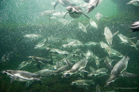 I felt, then, as if there were millions of beautiful penguins out in the sea of Plug-In and I just caught one nicely on my camera--just like the penguins in the Noorderdierenpark in Emmen (NL). And yes, if you look closely, there is a different watermark, in the right-hand corner, and somewhat less obtrusive than the standard LR2 one.
I also tried Mr Armes's LR2/Blog export plug-in; the entry on Berlin that I made earlier today, was made with it. But that one I found not useful: it may make it easy to upload a photo and add a little bit of text in a single go upon exporting from LR. However, you can only make simple unformatted text and also you cannot control the lay out of the photo in the blog entry. That was too limited to me, but if it's enough for you, have another look at the Photographer's Toolbox site.
For the few of us then, one of the very few nagging discomforts about LR2 is that there is no way to control the watermark you add to the photo upon export: it sits in the left corner, in a fixed font and size. Of course you can go to Photoshop or use external small applications (shareware or freeware!) to add textual or graphic watermarks to jpg-files after exporting, but that is too much of a hassle: we want more elegant, user-friendly solutions. And finally I found one--as the real buffs know since a long time.
 One Timothy Armes developed a plug-in for LR that lets you add watermarks but also borders and frames in one go while doing the export! The watermarks can be text, self-written or taken from the photo's metadata, or graphic, and you can control the font (in a somewhat awkward way, for Mac-users at least, but it works) and where it is placed. Once installed and once you have designed your watermark, it will be used automatically for all exports, unless you turn it off again: 'fire and forget', really easy!
 The multipurpose plug-in is called LR2/Mogrify and can be found in the Photographer's Toolbox; a Dutch-language, extended explanation was published in April 2009 (I'm really behind!) in DigitaleFotografieTips. The plug-in is 'donationware' and I guess that after a little more testing, I am going to make a donation to Mr Armes indeed: it seems to be worth more than whatever is a reasonable donation.
 I felt, then, as if there were millions of beautiful penguins out in the sea of Plug-In and I just caught one nicely on my camera--just like the penguins in the Noorderdierenpark in Emmen (NL). And yes, if you look closely, there is a different watermark, in the right-hand corner, and somewhat less obtrusive than the standard LR2 one.
I also tried Mr Armes's LR2/Blog export plug-in; the entry on Berlin that I made earlier today, was made with it. But that one I found not useful: it may make it easy to upload a photo and add a little bit of text in a single go upon exporting from LR. However, you can only make simple unformatted text and also you cannot control the lay out of the photo in the blog entry. That was too limited to me, but if it's enough for you, have another look at the Photographer's Toolbox site.
2009-09-19
Other autumn pictures
 My autumn depression is not as bad as yesterday's entry suggested: I may not have autumn colour photos, but the other typical autumn subject in nature is present in my photo collection: mushrooms and toadstools. Though I don't know the difference between the two. My dictionary says mushrooms are the edible kinds, toadstool the poisonous ones--never mind, I'm not going to collect any; two-thirds of the species in the Netherlands are on the Red List of endangered species. You can enjoy their beauty by watching--and photographing of course!
The photo, made in Holland a few autumns ago, may be of a mushroom called Oudemansiella mucida (synonym: Collybia mucida, teaches the Dutch part of the Wikipedia). I made a close-up with selective sharpness (f/4.0) to emphasise the fragility and the subtle colour; not for nothing the Dutch name would translate as 'china/porcelain mushroom'.
One thing had to be retouched, I admit: there was a bit of cobweb hanging from the hood which I clone-stamped away in Lightroom (who needs Photoshop?). Forgotten to 'look around' my subject when I took the picture! But if I hadn't told you, you would not have known, would you? If you find the spot where this photo was retouched, you earn a bottle of wine. Come and get it! ;-)
2009-09-05
Between f/2.8 and f/64 (2): Mr. 2.8
You can overdo with selective sharpness at f/2.8. Another of my favourite bloggers, Jeffrey Friedl, always uses f/2.8, it seems.
Did I mention Jeffrey Friedl before? No, I did not, I believe. He is an American who lives in Japan, and who is an avid amateur photographer--if he is an amateur, that is. For like a professional he seems to be taking photos full-time, and of everything, though he is especially good at landscapes—Japanese landscapes are good anyway and he makes them even better! He uses f/2.8 to make a subject stand out clearly from the background, and his professional lenses help to make the bokeh especially good: the number of blades in the diaphragm and their curvature seem to play a role in making the gradient from sharp to un-sharp as well as the rendering of un-sharp objects without irritating double contour lines and the like.
I came across Mr. Friedl when I looked for a smart way to upload photos to Flickr from Lightroom, and the official Adobe Lightroom website linked to his plug-in. Jeffrey Friedl proved to be a real Lightroom buff, who published all kinds of upload plug-ins, for all (well, almost all) kinds of photo sites. Once you know the trick, it's probably not so difficult anymore. Besides, his real profession is in programming. The Flickr upload plug-in was worth all its money (which was not much)--and more! It works really handy, once you have followed the (very clear) download and installation instructions from Mr. Friedl’s site.
As I said, he uses f/2.8 all of the time: check his blog full of photos, under each of which he neatly gives the essential statistics of time, aperture and if you drill down a bit also location(!). If nothing else, you can find a few nice wallpapers among his collection (watch out, that page takes some time to download!). But I wanted to make a little bit of fun of this Mr. 2.8. Once he wanted to take a group picture of a bunch of children and he was frustrated at not getting them all in focus at the same time. The examples he showed a few days before, again gave the statistics: f/2.8 most of the time. In the final one he used f/5. If he had simply gone down a few stops to, say, f/8 (the aperture at which many lenses have their optimum resolution and sharpness), the whole group would have been in focus from the beginning even though kids tend to move a lot more than landscapes—no problem at all! Even good photographers may forget their basics for a moment, sometimes… As long as you remember in the end!
2009-04-18
Learning shortcuts takes time... but will be worth it!
Some time ago I downloaded a Lightroom plug-in by Jeffrey Friedl to integrate uploading photos to Flickr into the export menu. Note: the first hyperlink is to the plug-in, the second to his blog--a must for Japan photo lovers! You can also click here for the plug-in.
 It took a lot of hassle to get it going--whether that be my incompetence or the complexity of the chain of software...
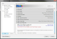
First, you must find out that you need Lightroom's "Plug-in Manager" (lower-left corner of the LR export menu screen, see the image right here) to install the thing.
Then, you have to find out that the plug-in does not automatically show in the export menu, but has a separate "header" (see the upper-right part of the picture).
Third hurdle: it takes some figuring out when exactly to log onto your Flickr account: before you start the export, in order to get the authentication process right.
It took me quite a number of tries, I admit, but when all is right, things go quite smoothly and it runs as smooth as a well-oiled bicycle. No more hurdles: the photos are online! It really is a shortcut now, from LR to my photo stream on Flickr in one go.
And at the same time my 6-week trial period is over... OK, I feel ready to register now (though that is not quite for free; the plug-in is "donation ware" or restricted to 10 photos at a time. Take your pick!).
 It took a lot of hassle to get it going--whether that be my incompetence or the complexity of the chain of software...
First, you must find out that you need Lightroom's "Plug-in Manager" (lower-left corner of the LR export menu screen, see the image right here) to install the thing.
Then, you have to find out that the plug-in does not automatically show in the export menu, but has a separate "header" (see the upper-right part of the picture).
Third hurdle: it takes some figuring out when exactly to log onto your Flickr account: before you start the export, in order to get the authentication process right.
It took me quite a number of tries, I admit, but when all is right, things go quite smoothly and it runs as smooth as a well-oiled bicycle. No more hurdles: the photos are online! It really is a shortcut now, from LR to my photo stream on Flickr in one go.
And at the same time my 6-week trial period is over... OK, I feel ready to register now (though that is not quite for free; the plug-in is "donation ware" or restricted to 10 photos at a time. Take your pick!).
2009-03-15
Lightroom 2.3 update
I haven't been following the forums lately, so it was Lightroom itself that--when I started the programme--alerted me to the fact that version 2.3 is available for download. Mainly interesting for owners of specific cameras (some Panasonic and Leica cameras, if I saw it well) and some bug fixes. Still, one wants to remains up-to-date with the software.
2009-01-18
Elementary, my dear Watson: is Photoshop Elements what photographers like me need?
We used to look down on Photoshop Elements: it did not give the tools and controls serious amateur photographers needed. I got an early version with my first digital photo apparatus and uninstalled it as soon as I could, as far as I remember. The choices in the old days were between simple browsing tools which had some editing options if you were lucky, like Irfanview or Picasa, or find a copy of the full-sized Photoshop that had mysteriously lost its hefty price tag. In the meantime, open source solution The Gimp has become an alternative to Photoshop in many respects, though even in version 2.6 (the most recent one I found) it still looks a bit like a collection of loose menus floating all over your desktop and it still cannot handle 16-bit colours, taking away my 'happiness of the smooth histogram'.
All the time, I forgot to look at Photoshop Elements, yet that programme has been extended in versions 6 and 7 to incorporate all kinds of tools that I and many other amateur photographers would look for, without getting as expensive as the big brother—it is available for € 90 or less, while Photoshop CS4 sells for € 600-800 or more (the higher prices are for the translated, Dutch version). Of course I do not hesitate to pay a sum like that for a new camera or a lens, but then I hope to enjoy that thing for many years without hearing about newer versions in a year or two—and to use all its options rather than feel that most of the menu options remain closed books.
Photoshop Elements lets you work with selection 'magic wands', layers and masks in the Full Edit mode, but has simpler ways of working if you just want the automated Quick Fix mode, or if you feel you are a novice (Guided Edit mode). It has a bit of the look & feel of Lightroom; I don't know yet to what extent the two integrate or are duplicating each other. For instance, Elements has its own cataloguing tools, but I do not want to give up my Lightroom catalogue that has been building up over a couple of years. Reviews on the web (just google for 'photoshop elements review') are fairly positive about Elements. The one thing I'd probably never use is online backup: I want to keep control of my own backups; they remain off line, no one else can see or (ab)use them.
Clearly, I need to find out a bit more about Elements to be as certain as a Sherlock Holmes about the choice for or against this package, but I sure would like to investigate if this is what I need. Any help you readers can give, is highly appreciated! Why don't you write a little comment?
2008-12-22
Improving Reproductions
 Did a second batch of old portrait reproductions for my father-in-law. I took more liberties than in the first batch. Let's call it progress of insight, but it was also a matter of realising the uses of technical tricks. The change of insight was that this was not about being as faithful as possible to the old pictures as they lay before me (as I worded it in my 2008-08-07 'Old skool' entry), but to aim for the best effect from the point of view of the beholders—my father-in-law, in this case. He wants these pictures as reminiscences of the ones depicted, or to get a better impression of family members deceased before he could know them. So what he wants is as clear a portrait as possible, a reconstruction of the original photo at least when it comes to the persons' portraits. Why didn't I think of that before? Every professional photographer knows it: people are not interested in the photos per se but in the persons!

Sometimes the photos were so bad that it was not worthwhile to try to improve them, but there were some cases where Lightroom 2 could spice up the persons' faces. Here's a little 'how to': photo 1 in this blog is a detail cut from the version I would have handed to my father-in-law in the first batch. But I did not like the flare from the backlight flowing over the roofs in between the houses. LR2 gives the option to apply corrections to parts of the photo: you just 'paint over' the area with a brush (in the Develop-module). To see where I am working, I set the brush at '+2 exposure' or something similar—as long as it is visible (see photo 2, from a different one, obviously, than the comparative picture). The brush settings include large size (for working fast) and a high feather (for a flowing, invisible border). Remember: LR makes no changes to your original photo at all, everything can be undone—no need to be nervous about painting a granddad a little white!
 Then I set the sliders in the painted-over area to what gives the best effect: in this case especially exposure down a bit; besides I added contrast and sharpness. The result is not dramatically different (my father-in-law must think it is the same old picture), but just a little more recognisable as a portrait. I hope you can see the difference in this small reproduction; I do, in the original of this 1930s family photo.
2008-11-26
Black-and-white photographers, be free!

A simple trick I finally learned from Lightroom is how in black-and-white photography, we should feel free from the rules. Until recently, when making a black-and-white print, I started from a colour picture that was more or less optimised. Not completely finished for printing in colour, but with colours corrected, the right white balance, etc. With some (pedantic) disdain, I never used Lightroom's presets to convert that picture into black-and-white, but did so by and, fiddling carefully with the greyscale controls that work more or less like the channel mixer in Photoshop: you can control how light or dark eight parts of the spectrum (from red to yellow, to purple and magenta) will be represented. And then I'd adjust the overall contrast to get nice dark, yet sufficiently detailed shadows and good highlights. That was before LR2; since then I'd add some dashing and burning in parts of the picture.

Once I tried the LR presets though and found that they used different effects: no use of the grayscale mix at all, but simple desaturation and ruthless adjustment of exposure and white balance! I won't follow their route completely; I'll keep using the grayscale mix to have better control of how my blues (sky!), reds (skin!) and greens (plants!) are converted into tones of grey, but radically changing the white balance (usually to a low temperature setting, say 4000 K) was an eye-opener that helps to get strong effects that work well in black-and-white. For it is the effect that counts, and we are not accountable for the numbers of the colour temperature to be correct!
The photos are symbolic of 'working'--seemed fitting to today's theme. They were was taken in Hanoi, earlier this month.
2008-11-16
Photographers, be free!

When we heard Frank Boots, spokesman of the jury and president of the national association BNAFV, explain his judgements on the photos in the regional contest, two remarks stood out for me.
The first was that amateur photographers are not accountable to anyone. We should feel free to make any photo we like. He did not go into that any further, but he must have meant something like our not being bound to be faithful to nature or facts, since we are not journalists or documentary photographers. Nor are we bound by the canons of art—Mr. Boots made this remark as something coming out of a public discussion he had had with a museum director. That part of his implication was not so clear to me: I thought that if any group were good at breaking canons and being free, it was artists.
His second remark was that there were typical camera club pictures: details of buildings, dilapidated window sills, and similar still-life pictures. Or portrait and model pictures that were neat, pretty-pretty. Mr. Boots wanted more than that, wanted something 'crazy', something personal, something (in the words of last year's jury in the same regional contest) 'authenticity'.
The photo that goes along with this blog, then must be an homage to camera club traditions, but after his remarks I did put it through Lightroom once more to make it something a little more personal. I'll spare you the details, but in the words of Dolly Parton, 'it takes a whole lotta money to look this cheap'—it took me a whole lot of fiddling around to make it look this cheap. By the way, the photo was made last week in Vietnam, just a wall on a street in Bat Trang, a village near Hanoi.
2008-10-23
Lightroom update: version 2.1
Adobe have published an update for Lightroom. The latest version is 2.1. They've added support for a number of recent cameras (such as the Sony A900) and fixed some bugs that I had not run into yet (so much the better).
Of course I immediately donwloaded it when LR 2.0 gave a pop-up telling about the update. All I can say until now is that 2.1 functions--and that is good news, I suppose!
Of course I immediately donwloaded it when LR 2.0 gave a pop-up telling about the update. All I can say until now is that 2.1 functions--and that is good news, I suppose!
2008-10-20
Fotobond's "DigiDag"
The national association of amateur photographers, the Fotobond or BNAFV, organised a national Digital Day in Apeldoorn, sporting a studio for model photography, a lecture by a pro photographer (Kees Tabak, which I did not go to, though his website promises very good portraits), and some semi-commercial entries from major photography/camera shop Calumet. They had a few shop things (but I don't need anything new at the moment) and gave some 'teasers' for their workshops in Lightroom and Photoshop. As an enthusiastic Lightroom user, it was good to learn some more tricks with the package--and even better was it to see Wout de Jong's enthusiasm for Lightroom as a pro photographer, too. He said repeatedly that LR saved him about a day's work a week, and the tricks that were new to me mostly were of the time-saving type. First, there were more keyboard shortcuts than I knew of (much faster than all those mouse clicks). Second and even more importantly, he used the sync function to great effect, to in fact copy the whole list of adjustments (if you chose all of them) from one photo to a host of others. Being a simple amateur, I don't often have series of photos, so I won't use this often, but it is a thing to keep in mind!
My Fotoclub pal, Mr. L., and me were surprised that there were not more than around 50 or 60 participants in this national DigiDag--we had half as many on our Club's digital day last Christmas, from just 30 kilometers around us!
My Fotoclub pal, Mr. L., and me were surprised that there were not more than around 50 or 60 participants in this national DigiDag--we had half as many on our Club's digital day last Christmas, from just 30 kilometers around us!
2008-09-18
Work and pleasure
 Last week I was out of the country, presenting my (and my colleagues') work at two conferences. Not a minute for serious photography, only the joy of having morning coffee in a medieval Italian monastery, now the Faculty of Economics of the University of Pavia--in dire need of restauration (it's Italy, after all), but still: that is the original environment for European universities!
 The joy of photogaphy came with the occasion to experiment with the A700's highest sensitivity settings: ISO 6400 and 3200, respectively (reduced jpegs of the otherwise unchanged RAW photo's). Especially ISO 6400 is close to useless; ISO 3200 is not bad for the purpose of documenting a late-evening tour of a vinyard.
And then there was the visit to the Certosa di Pavia. "ABC" in kids' jargon: Another Beautiful Church. Very beautiful, but not a place for very interesting photos. What can you add to all the beauty of the craftsmen of the 14th-16th centuries? I was reasonably satisfied with only two photos, and that for technical reasons mostly: I more or less mastered some challenges--next time I want to make some real nice pictures with that technical knowledge...
In the first, I wanted to make the craftsmen's beauty visible in a picture of a detail of a pillar plus the painted vault. To show both, I used the built-in flash of the camera with slow sync (otherwise the vault would have remained dark). The amount of light in the background satisfied me quite a lot. Of course, as a tourist on a conference, I did not come with a tripod, so the result is not quite sharp, but for a 0.7" picture it's not bad. And Lightroom 2 (great new options in this version--a must-have!) helped to sharpen it a little.

The other one, the church's facade, needed Photoshop to readjust the falling lines of the 16-mm perspective: I wanted to capture a lot of clouds above the church so in the fleeting moment when the light was right, I just had to shoot a bit upwards. When that was done, Lightroom 2 was used to make up for my lack of a gradual neutral-density filter; one of Lr2's new options is the 'graduated filter' and that helped to bring the picture back to the impression that the situation had made in reality.

Subscribe to:
Comments (Atom)