Showing posts with label composition. Show all posts

2011-10-08

Hipstamatic: a toy that needs a different vision

There are just so many apps available for taking pictures on the iPhone that one does not easily know what to choose, althoug a little googling will give you equally lots of lists with peoples' favourites. Hipstamatic is sure to turn up as one of them. So I donwloaded it a whle ago, but I must admit that I have not really often found a good way for using it.

It is a nice toy, but you really have to take a different look at taking pictures. I find that difficult. My vision is more 'traditional', most of the time. I want to take pictures that are sharp (selectively), well-exposed (for the purpose), etc. The creativity is in finding a good perspective, a good compisition--and in knowing what the picture should get across to the viewers.
This Hipstamatic game requires a different type of creativity and vision. It is more about colour, mood, and emotional vehicles to get 'something' across to the viewers. But I guess that it also leaves more freedom to the viewers--requires more involvement of the viewers as well, though: you as a viewer have to think much more about what this picture with these effects says to you. I'm curious to know if this one says anything to you. Reactions are welcome!

2009-09-09

Close to f/2.8


_DSC5461
Originally uploaded by DFW-Photo
The closest my standard lens comes to selective sharpness is f/4.5, so that's what I used here.

The "composition" of the still life is just as they happened to be lying on the table. It is almost a matter of principle to me that I take reality as given and do not interfere to make compositions "better" than what fate gives me. Exception: blades of grass or dead leaves and similar small things that I can easily take away.

Looking at the photo, I don't like the horizontals of the courgettes in the middle: they break the dominant verticals in the composition, and therefore take attention away from the area of sharpness, more in the foreground. Though that is a little better in the original large-size photo: there you see that the courgettes are really out of focus and the sunflowers stand out very clearly (or rather: sharply) from the dark-green background. (That effect is one of the reasons why you should never judge photos in the small screen on the back of your camera: sharpness and bokeh are very different in the original size.)

2009-09-05

Between f/2.8 and f/64 (1)

At Earthboundlight a blog entry appeared this week to answer a reader’s question: ‘Why would you want to have an f/2.8 lens?’ Bob Johnson, the author of Earthboundlight, looked at this question from the landscape photographer’s point of view. In Ansel Adams’s days, with the big plate cameras, you needed f/64 to get the ‘grand vistas’ sharp from front to end—that’s why Ansel Adams was member of the Group f/64. Current lenses ‘only’ go to f/22 (sometimes f/32), so landscape photographers tend to use those small apertures—and a tripod, because you get long exposure time at small lens openings. Luckily landscapes tend to stay in place long enough ;-)

What Johnson did not say was that at smaller formats, you get the same depth-of-field at lower aperture numbers. That is why it is so easy (relatively!) to make macro photos with compact cameras: with their tiny sensors, they get that flower detail all sharp at full opening, where a DSLR (especially a full-frame one) must stop down to f/22 to get the same. So for a landscape to be sharp from foreground to horizon, you can make do with f/22 rather than f/64 on a DSLR—if you want it all sharp.

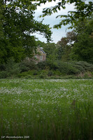
It gives a classical look to—especially—landscape photos to have them sharp all over. Give it a sepia toning and you’d almost believe it was a 19th century picture! But most of the time, you don’t need sharpness all over to get the effect you want: selective sharpness is much more creative. You don’t need that grass and branch in the foreground to be sharp for them to have the effect of suggesting more depth to the photo with the manor house in the background.

Selective sharpness also works in close-up photos: this minuscule blueberry flower was all you need to see sharply—it conveys the spring feeling much better with the strong bokeh (‘unsharpness’) than a picture bewilderingly full of sharp details would have done.

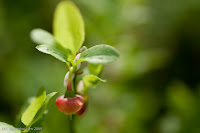
Both these photos were taken at f/2.8—I only have one lens that opens so widely. The wide aperture has the advantage that you get more light into the viewfinder, so you see more clearly and you (or the camera) can focus more precisely. Moreover, f/2.8 often signals professional lenses, which also have other advantages, like minimum distortion of straight lines, minimum flare, minimum chromatic aberration and other flaws. Their only disadvantages are weight (that kept me from choosing one as my standard lens)—and price…

2009-05-10

Yvonne van der Mey wins with photo "against the rules"

Yvonne van der Mey, who directed the workshops on nature photography that I followed the last two weekends, won a prize! The prize photo, entitled "Leopard male in the early morning, desperately looking for a female" she had shown to us during the workshop as one with which she was quite satisfied, although it went against a primary rule of composition, namely that you ought to see the subject's eyes in a portrait-like picture. But here, clearly, that rule does not really apply: we as viewers are following the leopard's gaze into the depth of the unknown, almost feeling his anxiousness.

That's a point about so-called rules of composition: you have to adhere to most of them to avoid mistakes in your photo, but you must know when to break one of them to make a truly good shot.

By the way, I wonder if the title of the photo was really true: maybe the leopard was just looking for food, or was frightened through hearing a pride of lions roaring, rather than being on the lookout for a mate, but it is a nice title that adds to the picture's meaning--it makes the animal more symphatetic to human viewers, and if that's what gives you a prize, why not?

2009-02-22

Dragonflies and the Japanese Flag

Question: What is the connection between dragonflies and the Japanese flag? Answer: a photo competition. The foundation for protection of butterflies and dragonflies in the Netherlands held a photo competition and in the article on the competition's outcome in its magazine Vlinders, the jury said that it first ditched photos that were "like the Japanese flag". No further explanation, so I had to think about if for a second or two, but then it dawned on me. The Japanese flag has a red circle in the middle of a white field, and that is--whatever else it may be in any type of symbolism or national honour and pride--not the model of a dynamic, interesting photo composition. So all photos with a butterfly or dragonlfly boringly in the middle of way too much space around it, did not make it to the second round of the competition.

I'd almost say that I wich I had that problem. I find it hard enough to get close enough to these fascinating insects to get a good picture (no, I would not settle for the amount of white of the Japanese flag) and then to have the luck that they sit still for long enough to et a sharp picture. All I can add to this first message in too many weeks on my blog is a testimony to my frustration, photographed in the Netherlands, last summer: some kind of a dragonfly that sat still for long enough, but I was too much in a hurry to push the button to take the time to make sure that I had enough sharpness and depth of field... Although it is red like the centre of the Japanese flag, at least it is not boringly in the middle and with a little cropping you can easily avoid the large (white) space around it. And then to see the amazingly good pictures that made it into the Vlinders magazine! Lots of room for improvement--let's try this summer!

2008-09-07

Composition with balls?

Sometimes, I don't quite know what to do with a photo. Take this one. I was attracted by the bunch of balls lying on the training field--the sportsmen and -women were probably gone for a break, or the trainer was preparing for the next bunch of kids coming. It was a funny picure, I thought, with the uniform green (artificial 'grass'), straight lines and the random composition of balls. But due to practical limitations (I had to take my pictures from the outside of the terrain, from the sidewalk in the street), I could not get a shot without the messy surroundings of the border of the field, stuff lying around, etc. And now I'm stuck for good ideas: how to maintain the feel of the area, and yet make it better than this messy snapshot? Cropping does not work well, I think, and that is the only trick I can think of. But I want to keep that one ball in the background, which gives some feeling of depth, or continuity that helps to make it authentic rather than a purpose-made composition. Wish I could go back, but the summer season is over around here, and anyway another time the trainer will not have had the same luck with his random throwing around of the balls.
If I succeed in making a better picture out of it, I'll let you know! Just remind me if I forget...

2008-06-02

Making 'My' Picture out of Nature

Making landscape or nature pictures a big question is what makes it special. What does the photographer add to 'what is out there'? Without a personal touch, anyone could have made it, right? Unless one has purely documentary aims, like showing peculiarities and habits of animals, or what they exactly look like. Then making the photo 'nice' and personal is just an added bonus, so to speak. But for the creative photographers, there is little they can do, it seems: find a good composition and good light. From a magazine I picked up recently (UK-based Outdoor Photography), I learned not alone that waiting for good light is a serious business and that some will visit a spot for days just to find that glimmer of sun between the clouds. Inspiring but also daunting: when would I ever take the time for that? Moreover, I noticed that many pictures, although they were digital, were made with filters to regulate the light. Polarisation filters of course, to influence glimmers of light on water surfaces, but also neutral grey graded filters to reduce the intensity of the sky. (Is it time to get into high dynamic range (HDR) photography instead?)

My picture this time is of a simpler make, a shot with just a little addition of composition to it. I guess you can debate if I should not have cropped it more, deleting some of the unnecessary foreground and background. But the point was how the bird, a common redshank ('tureluur' in Dutch), was mirrored by the water of the little pool behind the beach, in which it was foraging. No dear reader, it was not just a lucky shot; it was the best of a short series, and yes, I did wait for it to happen, but no more than a few minutes--I'm just an amateur!